Implementing a UX design process from the ground-up for an Enterprise SaaS product

Although designers can easily search for design processes or methodologies across the internet, it can be difficult to create a process from scratch that fits into a high growth business environment, where design experiments iterate quickly. This article is about the design process we created to meet our particular design needs at Sendbird.
As the number of people in our team gradually increased at Sendbird, members all agreed that we needed an intimate system for sharing work and a flexible design process to meet the diverse and frequently communicated perspectives from product stakeholders. As an added challenge, we needed a solution that we could introduce gradually, wouldn’t cause too much change too quickly, or slow down our rapidly iterating designs.
Sendbird UX Design team before implementing a new design process
Before we designed the system that follows in this article, we identified three problems that it would need to address. These arose from the way the design team had worked previously – working on a small team, addressing many team’s needs, and also having ambitious design goals. After a review of our design practices, the following are the points we needed to address. Taken as a whole, they point toward better information sharing and better criteria for design decisions.
Problem 1. How to prioritize projects and share project background
Previously, UX/UI designers and developers working on projects handled multiple tasks at once. As an effect, tasks were often escalated on an as-needed basis, rather than being prioritized or discussed based on need, research, or data. It was not easy to understand a given task’s backgrounds, especially if you were not a project member, because there wasn’t any historical account of the design work or gradual changes.
Problem 2. How to create criteria and analyze data for design decisions
We conducted much of the benchmarking, customer feedback, personae and market research on an individual rather than team basis. It was not easy to find related materials or even confirm whether the research material was the appropriate reference.
Problem 3. How to define design goals across the product portfolio
Well-defined product problems were often only articulated locally among designers assigned to a particular task, so there wasn’t a uniform goal across the team or product, and there were variations in the definition and purpose according to each team member.

The only UIKit you need to build in-app chat.
Solution – Implementing our design process
To solve these issues we implemented a design process that follows these basic steps, focusing particularly on the early design strategy.
- Visualize the UX workflow
- Understand the project background and requirements
- Use quantitative and qualitative data for UX design
- Identify and prioritize UX problems
- Wireframe a solution
Visualize the UX workflow
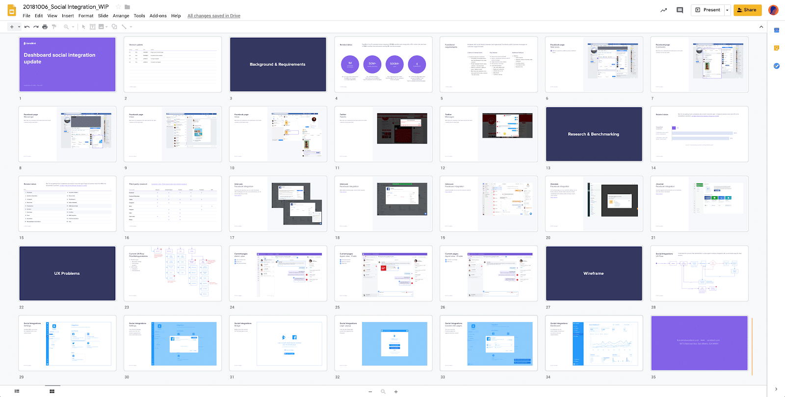
Our first goal was to visualize the entire UX design process in a single document. To accomplish this, we organized the skeleton, which includes slides for other design steps like “understand project background,” “gather related data,” and prototyping. These were all necessary parts to include but had been missed because of resource constraints, or a lack of time. With this document, we tried to connect the dots from the research-stage to the final output by mapping everything out, by getting feedback from collaborating teams, and by iterating on the flow order or adding needed context.
These documents became the central nexus for design work on a single project. This meant that we focused on building context around a design, rather than simply sharing final results. So, if there were debates about design from other teams or designers, then we could communicate effectively the intention behind the design decision. It helped us build alignment with other teams and make better design decisions.
This detailing occurred at a pretty granular level. If there was a related document for a slide, for example, we would add a link to the description section. To organize our thoughts, we added slides and received comments on the document from team members in real time. We also used it as meeting material – it being equally effective as a way to share work internally.
Below is an example of one document. By mapping this of the design flow, we were able to see the entire process at once and click into a relevant step in the UX flow or part of the process to see background and relevant information.
Understand the project background and requirements
As a first step in the process, we needed to analyze the current UX flow, understand user behavior through both qualitative and quantitative measures, and diagnose problems. This stage maintains the health of our product flow and diagnoses potential problems.
While quantitative data on customer behavior serves as a source of validation for UX health, customer feedback gives us a key reference for developing new features. It’s crucial to maintain this feedback loop, to talk to users and understand their needs.
“Sometimes we have customer feedback or inquiries that come in via social media or email. I hope we can check and manage it in one place.”
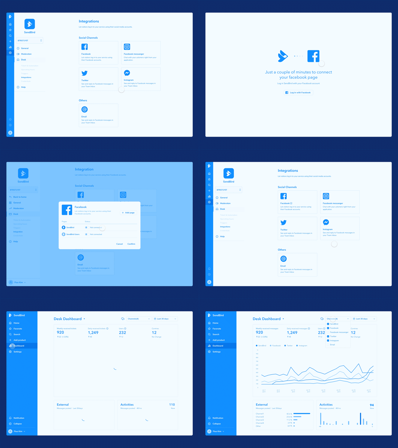
From this offhand feature suggestion, we built a UX flow that integrates social platforms into our own product and introduces both messages and a ticketing system.
Research: use quantitative and qualitative data for UX design
To establish a good hypothesis for solving any given UX problem, we will often benchmark software tools that have a more mature product (read: product focused and older companies) to see how users access similar services or functions in our product. You can also anticipate common problems and solutions at the same time by performing a comparative analysis or design audit with these advanced services. You might see both positive and negative examples, or even identify gaps in UX features that you’d like to fill in.
Below is a comparison chart we used to give us a quick sense of which features were necessary and which were great possibilities according to other products. Products will vary on feature breadth and depth, but this comparison can give you a quick check on what features can help solve a specific problem or identify features for the roadmap.
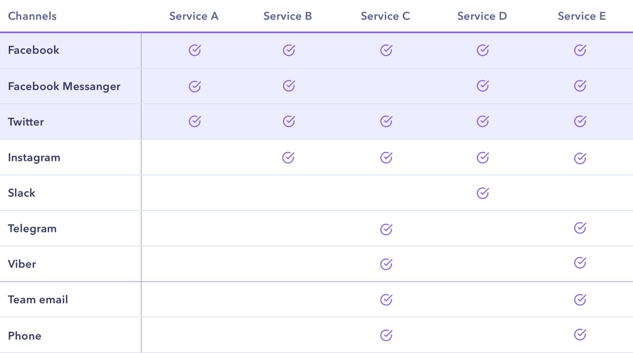
To address the social integration suggestion above, we researched SaaS solutions with social integrations and compared all their available integrations to help us prioritize – channels like Facebook, Twitter, Instagram, e-mail, Whatsapp, etc. Among all these channels, 3 were basically essential for integration. We logged into each and referenced the user flows from the 3 essential channels into the set of SaaS solutions we researched. This gave us a clear sense of what worked, what didn’t, and a great baseline to start.
Identify and prioritize UX problems
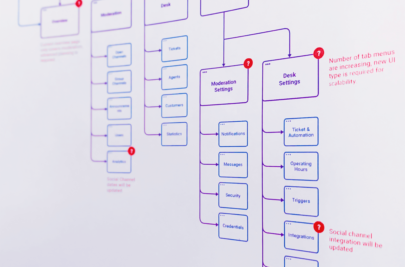
Features that need to be integrated into an existing UX flow should first check the current document and flow to gauge potential problem areas. An additional feature can obviously add steps, so it’s important to diagnose any potential problems ahead of time to save you work later. Designing the UX flow also displays any parts of the existing structure that need to be changed.
For social integration, for example, we added pages that integrate social channels to the existing settings page and created detail page to follow each. Other than simply adding the necessary pages, we needed to modify the settings menu for UI extensibility.
Wireframe
At the UX planning stage, we wireframe with a blueprint kit that provides a very general UI to help us identify and focus on any essential problems. Then we repeatedly share opinions and feedback. Finally, we modify it with other project members. If there’s a complex UX flow, we check for missing or awkward parts using a prototyping tool.
Results of the design process
Thanks to the newer design process, we identified which elements we should share with other collaborating teams outside Design. We also limited and, in many cases, solved for feedback-fatigue caused, in part, by the different feedback provided by stakeholders outside the design team.
By communicating our process and research more transparently, we able to raise comprehension among other teams about the improvements made to UX. Our recommendations and changes have become more convincing, especially more so than when they were improvised. Since the project requirements and constraints were more transparent, it also became easier to consult with other teams.
Lessons
At first we thought the design process would make forward progress by moving from page to page in the UX flow, but, in reality, there were many, many feedback loops. We made continuous improvements by going back to the previous step to reconfirm and then move to the next stage over and over. We approached the design as a more integrated system – checking issues and ensuring that the UX flow is moving in the right direction for the product. Unfortunately, there was no avoiding the increased workload that was required throughout this process nor in the detailed discussions.
But, in the end, it helped us come to alignment internally among the Design team and externally with the rest of the company. And we made better, more informed decisions that also incorporated feedback more flexibly.
Next steps
We plan to invest more strongly in getting closer to the customer’s perspective and focus on qualitative research about each product user’s role. Rather than borrowing a well-known methodology or process, we will continue to sort out what is inefficient for our particular team, consider which workflow is better, and experiment with it little by little on each real project.
Given that, however, we still focus a lot of attention on each individual designer who works with us because the goal of Sendbird’s UX design team is to improve each team member so that, in turn, it will lead to the growth of our product.
Contact us today to get started!
