How to build a WhatsApp messenger clone in React with the Sendbird UIKit

With over 2 billion users and 100 billion messages exchanged daily, WhatsApp is the most popular messaging app in the world. While its ease of use for user-to-user messaging and ability to have conversations with businesses have contributed immensely to its popularity, WhatsApp has recently faced flak for the rise in the number of companies spamming users with promotional messages.
Brands can avoid this issue by building in-app chat. Context-rich in-app chat means that a company's important updates, news, and announcements won't be lost in a messaging inbox overflowing with spam. In-app chat also provides a lifelike messaging experience while giving brands responsible control of user data. This is important because messaging for businesses can become an essential part of the foundation upon which a brand is built. "Messaging is the new way to get business done, better than an e-mail or phone call," said a Meta spokesperson.
That's why, in this blog, we'll find out how to build a WhatsApp messenger clone in React. For this project, we'll use Sendbird React UIKit. Sendbird UIKit enables developers to build a tailored chat experience with highly customizable UI components. In this blog, we will understand how the components provided by UIKit make up each aspect of our custom integration to achieve our goal – building a WhatsApp messenger clone in React.
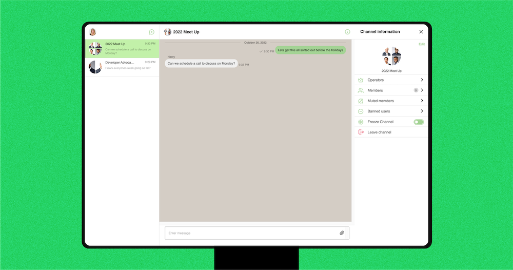
By the end of this blog, this is what you will have built for desktop:
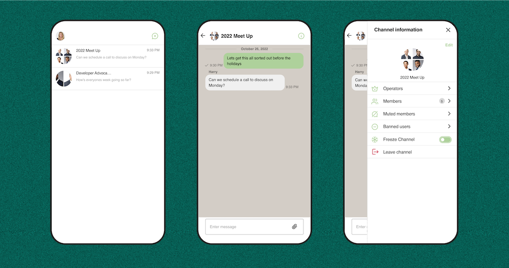
And this is for mobile:
Getting started with your WhatsApp messenger clone
To get started, create an application in the Sendbird dashboard. Here, you can access everything provided in your chat service. Once an application is created, you will need to save the Application ID that is generated to initialize the Chat SDK in your React application.
Generate a React application and install the Sendbird React UIKit with npm or yarn:
Once UIKit is installed, we can import the necessary components for our application from UIKit.
Components & modules for a WhatsApp messenger clone in React
To start, we will use the SendbirdProvider as a general wrapper for the multiple modules we will include in our application.
For our example, we will use the ChannelList, Channel, and ChannelSettings modules. With these three modules, we’ll create a mobile and desktop view. The mobile view will render either the channel list or both the channel conversation and settings menu together. For the desktop view, we will have the channel list and channel conversation side by side.
First, we’ll import the SendbirdProvider and UIKit’s stylesheet in the App.js file:
Note: Here, we are importing SendbirdProvider and referring to it in our application as SBProvider. You can choose what you would like to refer to it as in your own application.
Then, apply the following CSS to our stylesheet, which will be in the styles.css file:
Now, we want the application to work on desktop and mobile views. So, within our provider component, we must check for the window’s screen size. If it is the size of a phone screen, it will render our mobile view. If it is above the number of pixels of a typical phone screen, it will render a desktop view. Therefore, we’ll create two components and name them MobileView and DesktopView. Both of these components will contain our modules.
After those steps are completed, the App.js file will look like this:
Note: In the dashboard, if you issue a user an access token, you will have to pass the accessToken variable into the SBProvider as seen in the above code sample.
Desktop view
The desktop view is the default Sendbird layout with the channel list on the left side and the conversation on the right side. Our DesktopView component returns a div with a className of “sendbird-app__wrap”. This className is already styled by Sendbird’s default design that displays the channel list next to the conversation window.
Then, we have to set the sendbird-app__wrap div’s height to be 100vh, which is the size of the entire window screen. Within this div, we’ll place the channel list, channel conversation, and channel settings components.
Import the channel list, channel, and channel settings modules. They will be referred to as SBChannelList, SBConversation, and SBChannelSettings:
We’ll add a div around each component and by using the following classNames, it will apply the default UIKit styling to our components. The following are the classNames for each component:
- For the channel list, the div className is “sendbird-app__channellist-wrap”
- For the channel conversation, the div className is “sendbird-app__conversation-wrap”
- For the channel settings, the div className is “sendbird-app__settingspanel-wrap”
In the channel list component, we’ll use the onChannelSelect property to set the channel being clicked on from the channel list. The channel conversation will pass in the channelUrl and use onChatHeaderActionClick so that we can listen for when the user wants to open the settings bar. For the channel settings, pass in the channelUrl property and use onCloseClick to close the settings bar view. Please see the code samples in the Customizations section below to see what this looks like.
Mobile view
The mobile device view will have either the channel list component or channel conversation component rendered to the screen. If a user is on the channel list and clicks into a conversation, the conversation window will render. If the user clicks to go from the conversation to the channel list, the channel list will render to the screen.
For the mobile view, we’ll return a div with the className “mobile-view__wrap” and within that, place a condition where if the current channel is not set, then it will return the channel list component. Otherwise, it will return the channel conversation window and settings component. The settings component is only rendered if the user clicks a button in the conversation window to open the settings menu.
In the stylesheet, set the element with the className “mobile-view__wrap” and “sendbird-app__conversation-wrap” height to be 100vh so that it takes up the entire window screen.
We’ll utilize the same properties for each component as we did previously for the DesktopView. For the channel list, use the onChannelSelect property as well as disableAutoSelect. The disableAutoSelect property is used so that the channel list doesn’t automatically render the first channel in the list.
The desktop view displays the channel list and channel conversation side by side. However, for the mobile view, we’re only viewing the channel list or the channel conversation so the auto selection should be turned off. If you don’t include disableAutoSelect, you will find that the view will constantly render the first channel within the conversation window and will not allow you to go back to the channel list since it is constantly rendering that channel. Therefore, the disableAutoSelect property is used to select the channel you want to view in the conversation window and switch from viewing the channel list to the conversation.
Next, above the SBConversation component, we want to add a back button. The back button will be displayed in the channel conversation and go back to view our channel list. The conversation component will pass in the channelUrl and use the onChatHeaderActionClick. The onChatHeaderActionClick will toggle the settings bar to open. The SBChannelSettings component will use the channelUrl property and onCloseClick to close the settings menu.
Customizations
We can begin to add in customizations to give your chat more of a Whatsapp-like style. In both the DesktopView and MobileView, we will create a function that will hide the settings bar and a function that will render the settings bar.
To hide the settings bar, within the function, we will grab the element with the className “sendbird-app__conversation-wrap” and set its right margin to 0px. This function will be triggered in the SBChannelSettings using the property onCloseClick. To open the settings bar, in the Channel component within the onChatHeaderActionClick property, it will call the renderSettingsBar where it grabs the element with the className “sendbird-app__conversation-wrap” and sets the right margin to 318px.
So, opening the settings will change the layout of the conversation window so that there is space on the right side of the page for the menu to exist. Then, when the settings menu is clicked to close, the conversation window will expand out to where the setting bar was previously.
To have the settings menu appear, we want to add some CSS in order to position it correctly in the window view:
From here, you can alter any CSS customizations to appear how you would like the settings menu to be positioned.
With these implementations, the MobileView will return this:
And the DesktopView returns this:
colorSet
Next, we want to use the colorSet property in the SendbirdProvider to define the colors that make up UIKit’s theme. Once we define our colorSet, we have to make sure to pass it into the SendbirdProvider component.
For our example, we will set the variable –sendbird-light-primary-100 to be light green. This color is applied in the channel list as the background of the selected channel, the background color of the container for an emoji reaction, and the background color when the current user edits their own message. For our example, we can change the color to match our outgoing messages to a lighter shade of green.
Next, we want to define –sendbird-light-primary-300 to be green. This variable is used on the outgoing messages background color, on the create a new channel button in the channel list, as well as on the icons such as the settings icon in the channel conversation and all icons within the settings menu.
Then, we will set the –sendbird-light-primary-400 to be a slightly darker shade of green. The elements that use –sendbird-light-primary-400 include the background for on hover of outgoing messages, on hover of the save button when you want to edit your own message, and on hover of the create button to create a new channel.
An important colorSet variable to note is –sendbird-light-background-50, which is called for the background-color of each component. The current default color is white. Instead of changing this variable to have one uniform background color or leaving the entire application’s background color white, we’ll implement CSS to change the conversation window’s background color to light beige. We encourage you to check out the complete list of the colorSet variables.
The App function should look like this now:
Channel customizations
For some finishing touches, we’ll add CSS. For incoming messages, we want to remove the profile image icon next to the user’s name. Once we remove the user’s profile image, we want to remove the min-width styling that’s applied to it so there is no empty space where the avatar was before.
Channel list customizations
In the channel list header, we want to remove the current user’s nickname and ID. Instead of using CSS to achieve this goal, you can alternatively use ChannelList’s UI component ChannelListHeader to customize your own specific design to override the default layout.
For the channel preview component, we will set the display to none on the member count that’s displayed next to the group channel name. Another option to design your custom UI for the channel preview would be to utilize ChannelList’s renderChannelPreview property which would replace the default Sendbird header with your own custom component. If you’d like to see the code, please see the complete CSS stylesheet!
This is the final result when on a desktop:
And this is what it looks like on a mobile device:
Your WhatsApp messenger clone: A feature-rich WhatsApp-style chat implementation
Congratulations! You have now built a WhatsApp messenger clone in React. You have a functional WhatsApp-styled messaging implementation composed of core components and modules from the Sendbird UIKit. From here, you will be able to build your chat experience with the essential elements to fit your application’s needs.
Please view this GitHub repository for an overview of what we have walked through. For more information, you can also check out our docs or explore the wealth of UIKit tutorials on our developer portal. Check out the community forums or contact us if you need help with the Sendbird UIKit. Our experts are always ready to help!
Enjoy building your WhatsApp messenger clone! 💻