How has Sendbird purple evolved?

Color = A vital element of expressing brand
A successful brand color helps establish a strong identity for a company, elevating its value and giving a positive impression. Therefore, color is an indispensable aspect of forming a brand. The importance of color can sometimes be dismissed as merely a matter of personal taste, but its impact is powerful. Selecting the right brand color is especially important for startups since color can imprint the brand and service in the minds of customers and drive awareness.
Why is Sendbird purple?: differentiation and innovation
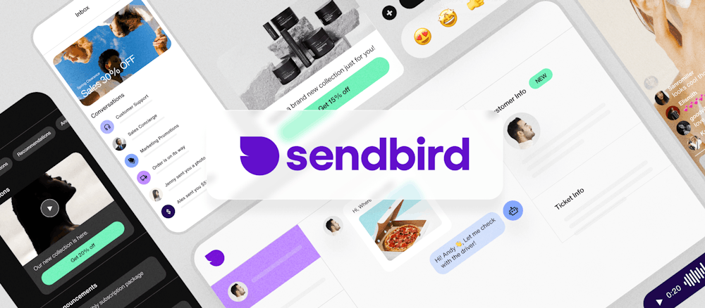
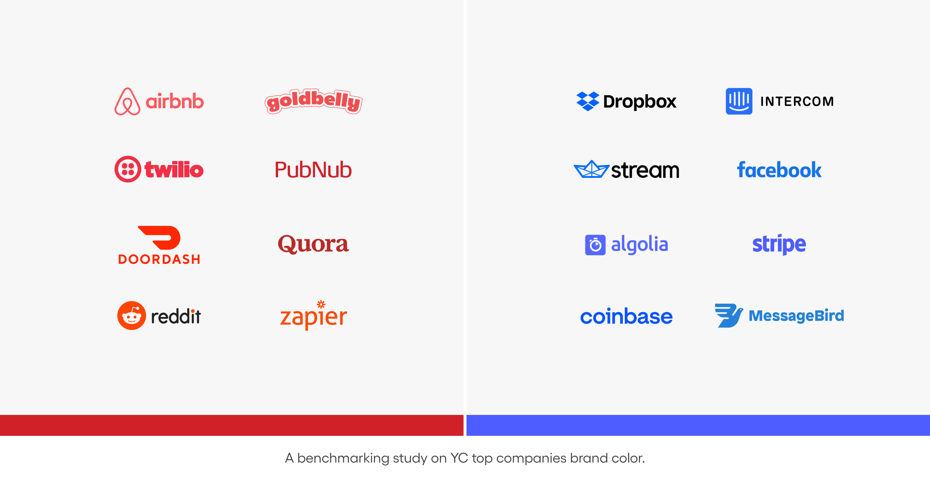
Sendbird’s brand color is purple. When we were preparing for Y Combinator, most SaaS companies were using shades of blue or red. Sendbird chose purple to differentiate ourselves. In part, it also gave a sense of trust and stability. Sendbird needed a bold and unique color. That’s why we chose purple.

Virgin Mobile UAE improved their CSAT with Sendbird Desk.
The evolution of global brands’ colors
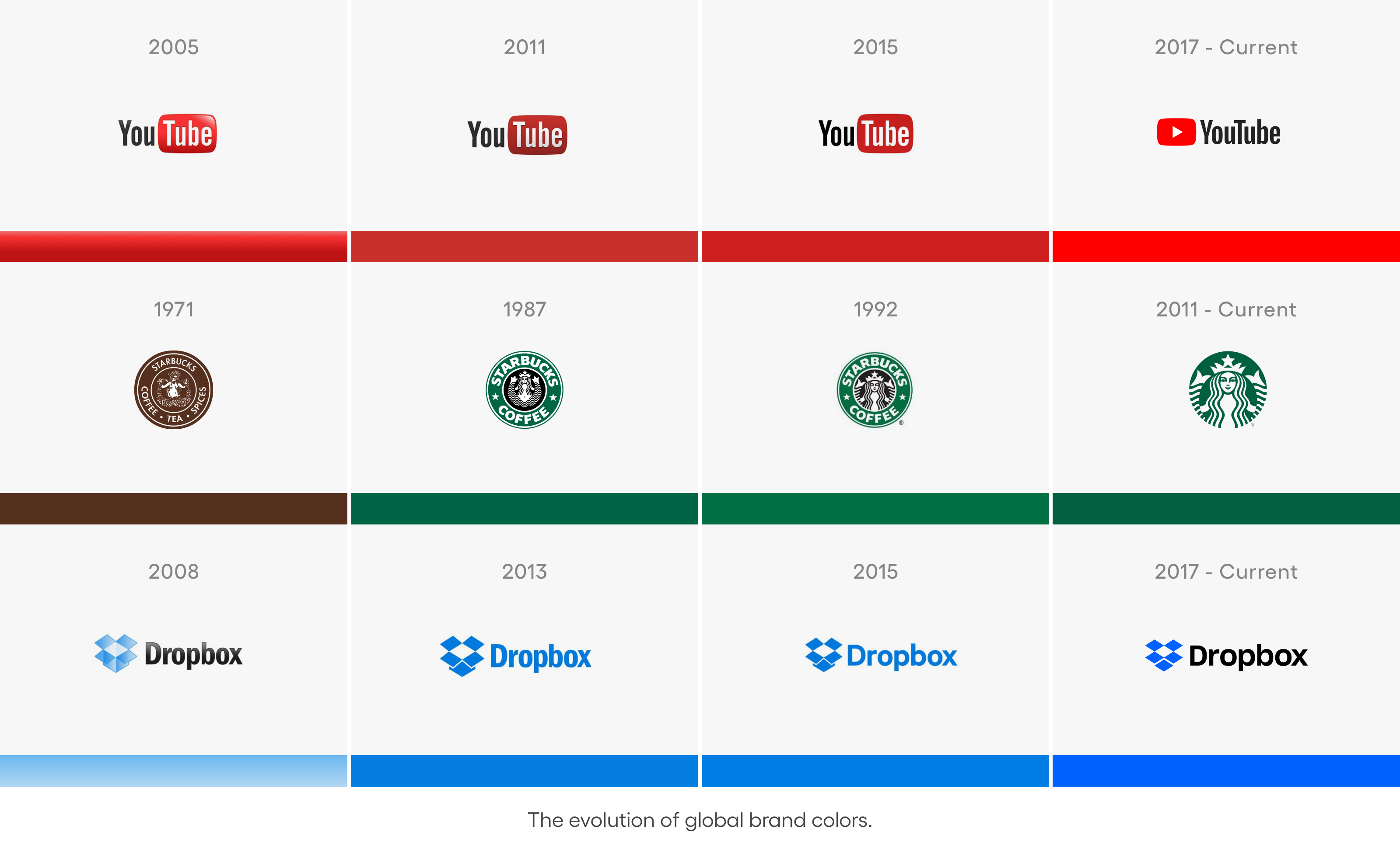
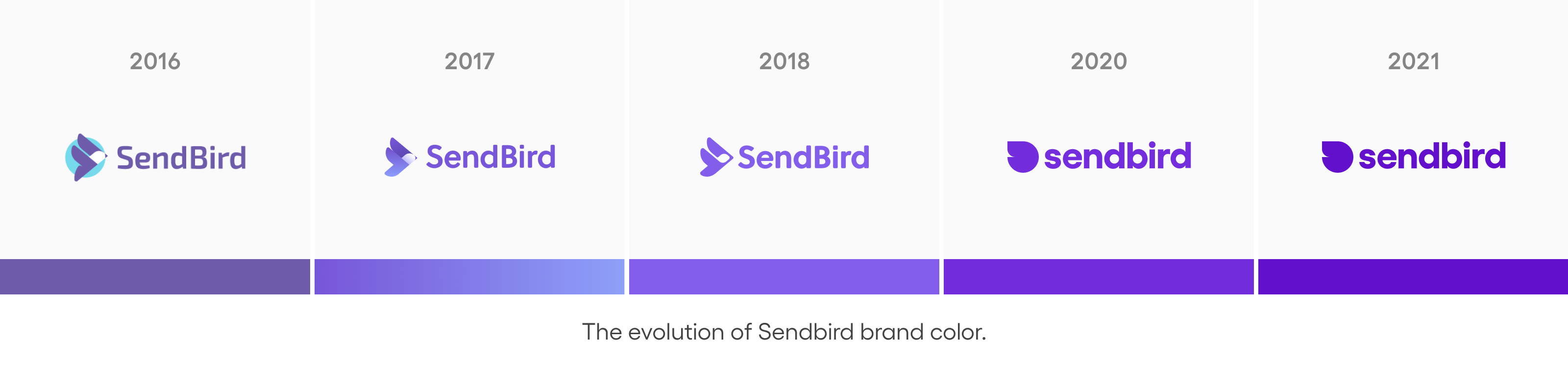
It’s already been five years since Sendbird defined its brand color as purple. As you can see in the image below, various global companies such as YouTube, Starbucks, and Dropbox have been adjusting to add more simplicity and clarity while maintaining the original color. Likewise, Sendbird is in the course of finding its color while respecting the existing impression users have.
The evolution of Sendbird purple
There have been many changes to Sendbird’s color during the past five years as well. We contemplated darker color options for clarity in the process of improving the color. However, the most important thing for the Sendbird brand design team was to respect the original positive impressions (clear, fresh) users had while improving the existing color. So we developed our brand color based on the two criteria below.
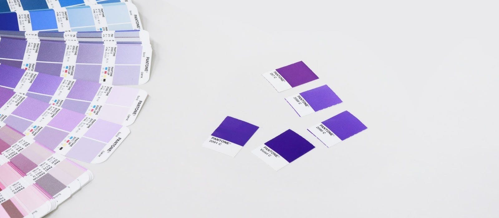
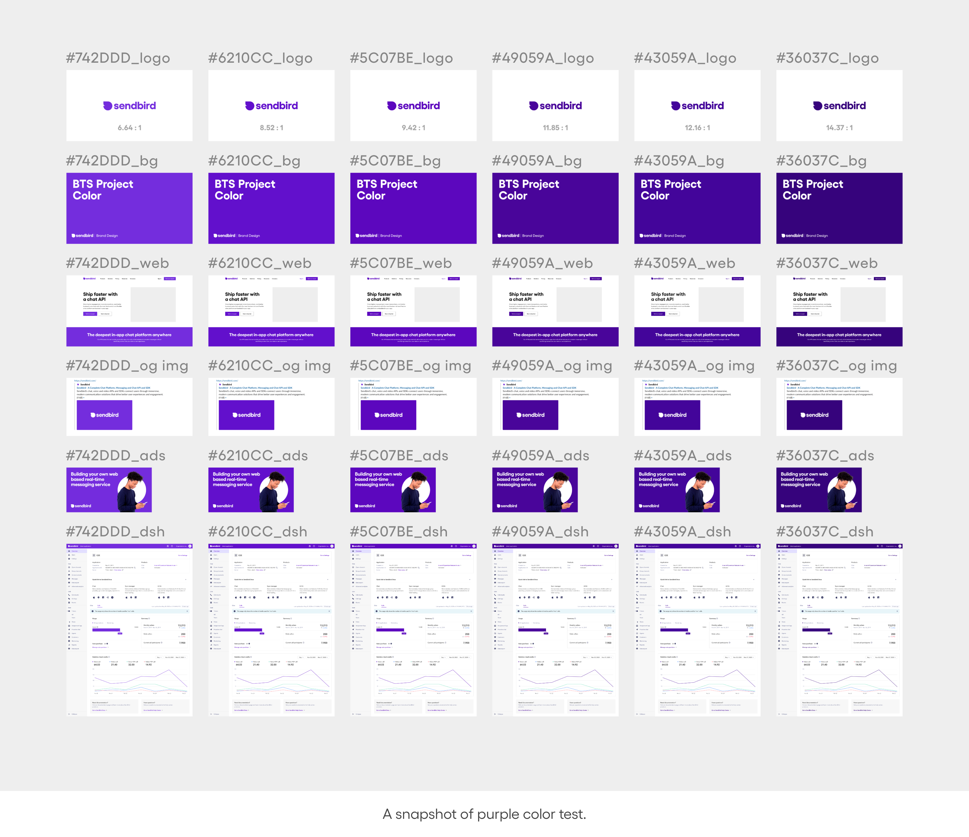
The clarity of the brand color is vital. There were a lot of cases where the brand color was by itself in articles or deck/documents for customers. However, the original Sendbird purple lacked sharpness as a sole logo or background color. To address this drawback, we lined up some sharper options than the original purple to find a color that can stand out in a logo, background, text, etc.
As for purple, even a tiny amount of red or blue can be perceived as a completely different color, so we kept this in mind during our testing.
Our new purple
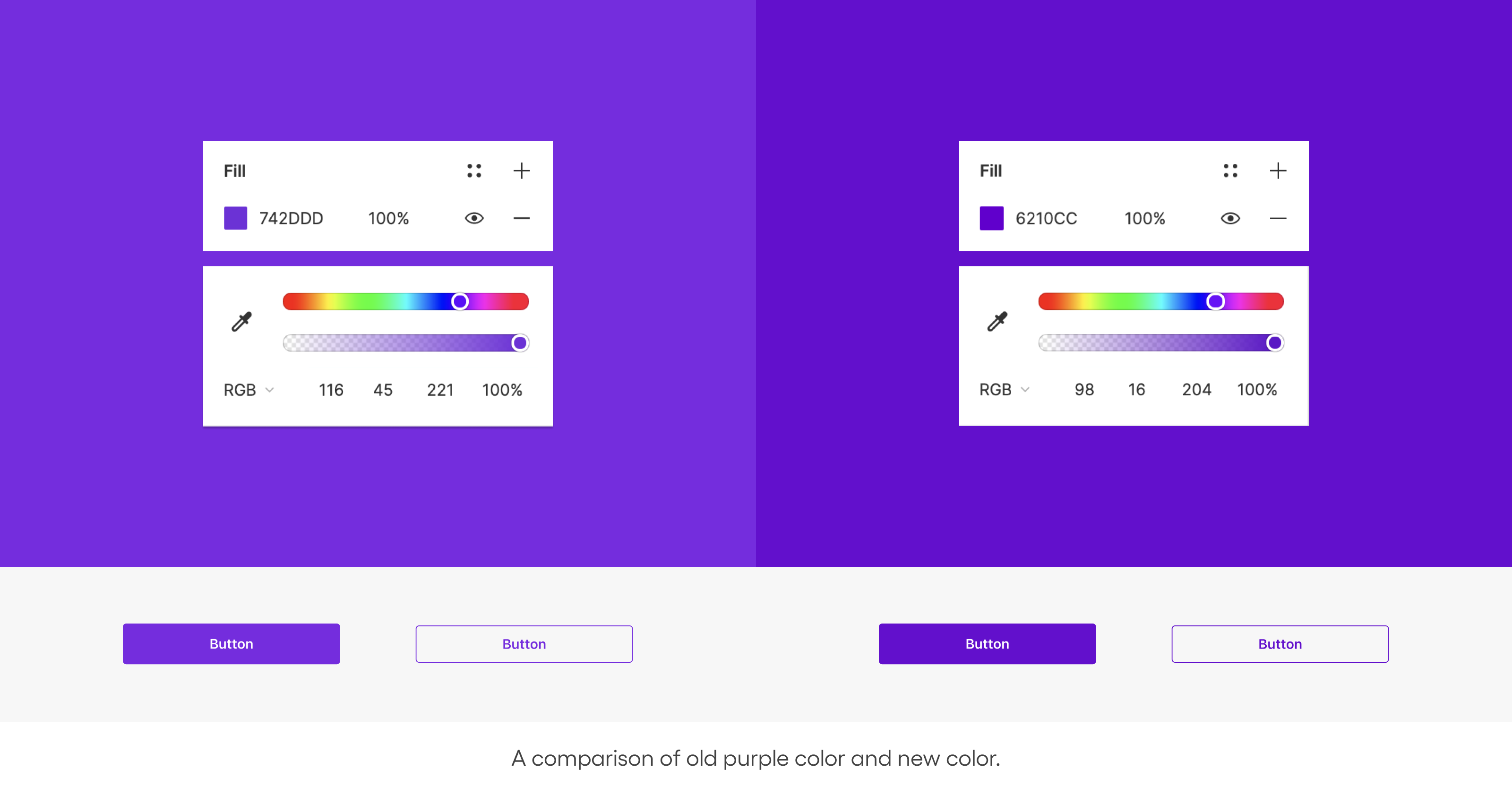
The right-hand image below is the new Sendbird purple. If we compare the original color(#742DDD) with the new color(#6210CC), you can see the new one is sharper. Now we can deliver information more clearly when used over a large area as a background color. Also, it improves accessibility when used as a functional color. Moreover, this is a color that’s not perceived entirely differently by the users.
Currently, the design team is applying the improved purple color to Sendbird products, webpages, and marketing deliverables. It wasn’t an easy process since we had to coordinate different perspectives on the original color and needs from each team(UX/UI, Marketing, Brand) without tampering with the brand identity. But with relentless discussion, we were able to find a brand color everyone was happy with.

Next step
That was the story of the Sendbird brand color ‘purple’. Sendbird purple is tricky to handle and can be very delicate even with the designers. Still, we believe it can be an engaging and unique brand color if appropriately used. Further, we plan to test secondary colors to better highlight the brand color and consistently define sub-colors across diverse use cases (webpage, ebook, deck, swag, etc.