The heart and concepts behind Sendbird’s new look

refresh | rəˈfreSH |
To give new strength or energy to; reinvigorate
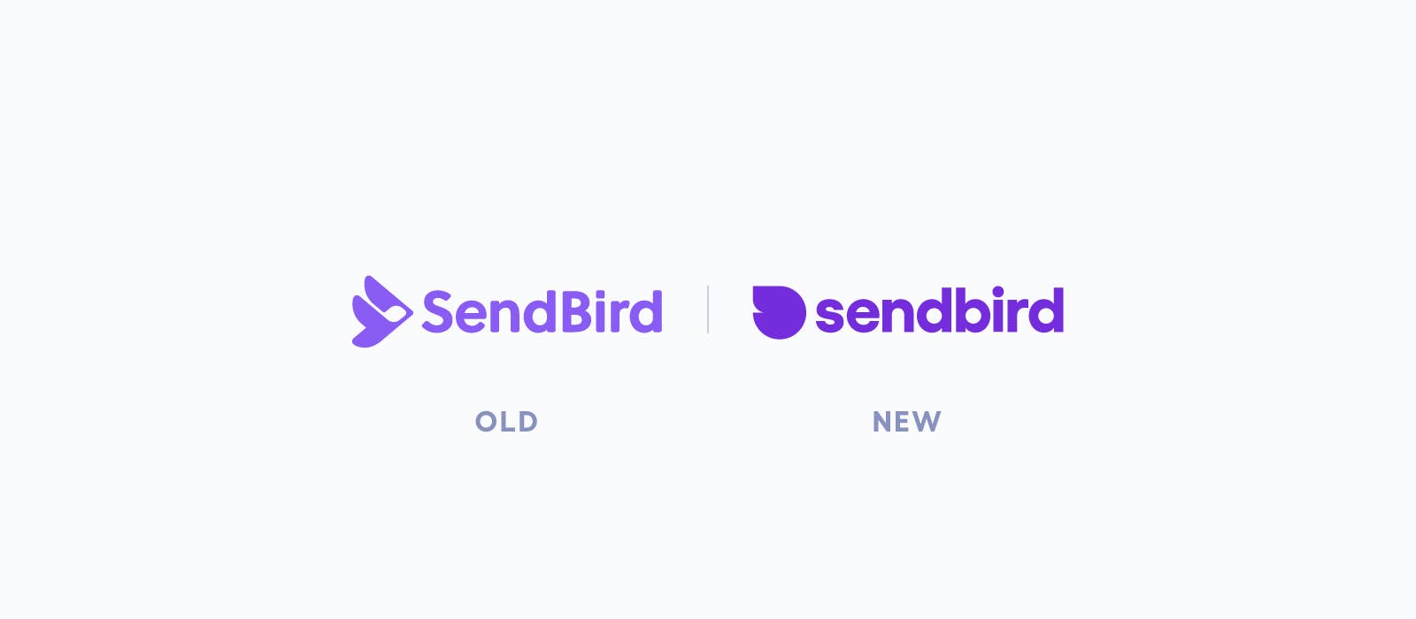
Announcing our new Sendbird look
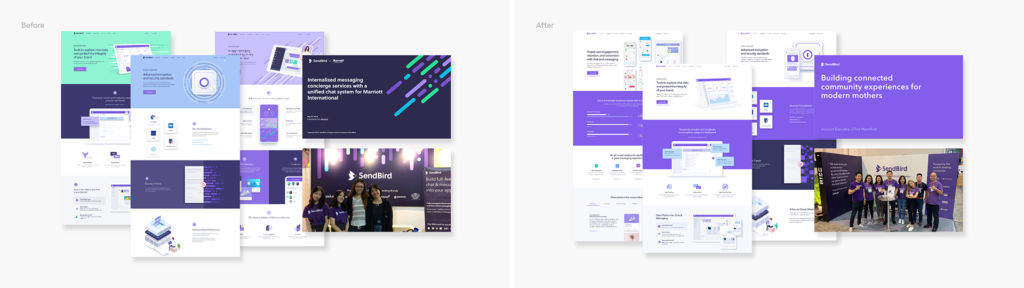
We at Sendbird are happy to announce that along with a refreshed mission, we’ve launched our new logo and a new look. As our global communities continue to find and reinvent their sense of belonging and connection, our goal is to evolve right alongside our human family.
We’ve re-evaluated and refreshed our mission — we don’t want to simply enable interactions. We want to help foster deeper human connections in our digital world. We thought long and hard about what type of aesthetic would truly reflect the heart of our brand and we’d like to share it with all of you.
So, why now?
We’ve worked tirelessly over the past few years to build our brand — at a very fast pace. But as customer and community needs continue to shift and transform, we realized that we were at a critical time for the brand design team to create a look that truly evoked our new mission.
And as we all embark on the journey into our shared global future, we look forward to building a Sendbird brand that will welcome the next chapter.
How did we approach our design refresh?
We looked back to look ahead
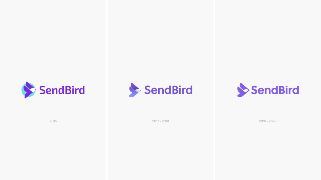
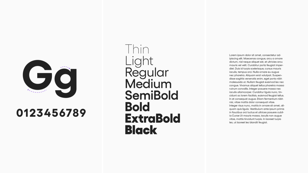
First, we looked back on what we’ve accomplished thus far, together with our customers, and how we had initially developed Sendbird’s image. Over time, we had continued to simplify our logo. Sometimes less is more. We wanted to retain that simplicity.
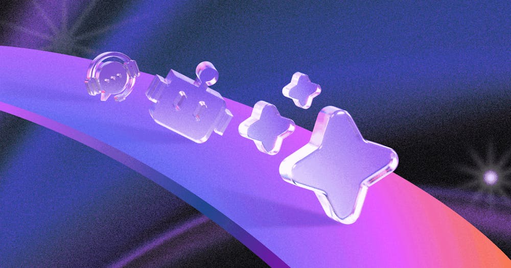
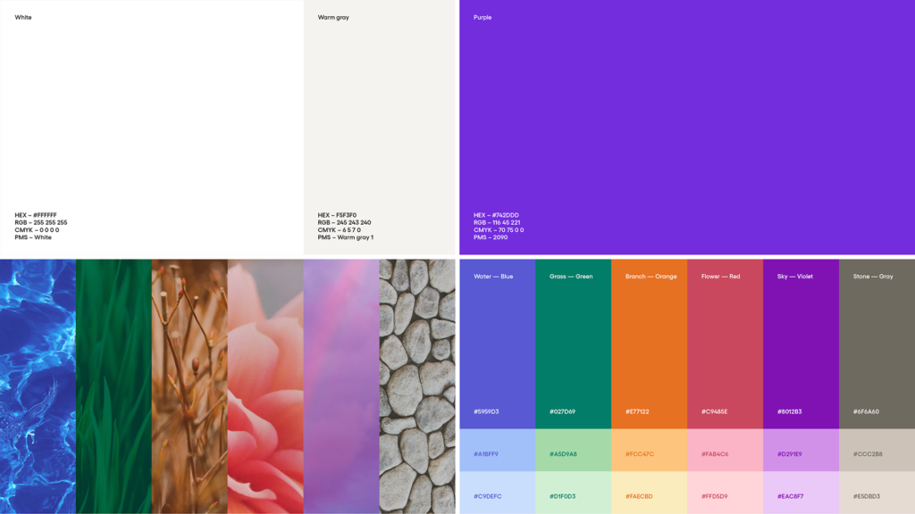
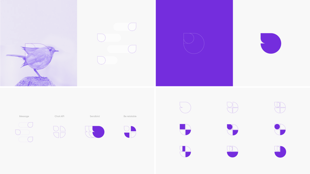
We also distinguished our brand color as purple from the getgo. Purple feels contemporary, new and inventive. It’s just cool — figuratively and literally. Purple often signifies creativity, newness. We want to help brands find new ways to innovate their communication platforms and connect people. Our supporting colors, white and navy, help the purple pop. And we decided to keep our purple color, but make it more vibrant.
Our secondary palette is inspired by nature. Because of the bird imagery, we’re so attached to … and because the natural color palette just felt right.
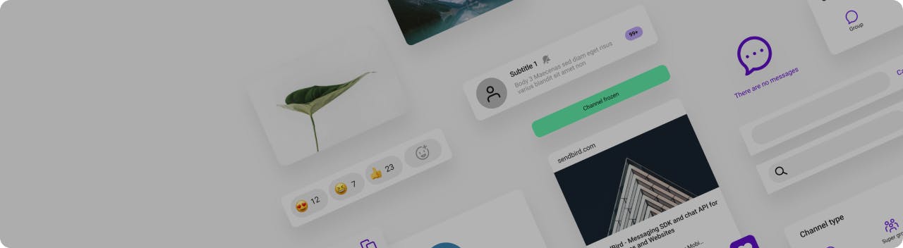
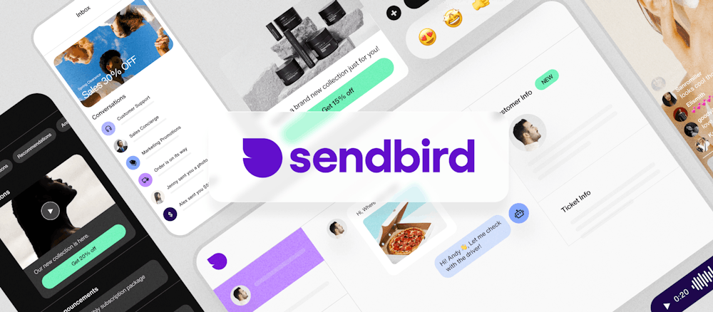
The only UIKit you need to build in-app chat.
Then, we asked ourselves the basics:
Why do people need Sendbird?
Humans need connection. People want to communicate. And although we began as a messaging API, we’re so much more than just a messaging function. But the concept is simple: Do you want to build a relationship? Just send a bird.
So our look is simple and clear, cool and crisp
As a messaging SDK and chat API, our solution may sound complicated at first … but in reality, it’s pretty straightforward. We have a good vibe in our office, amongst our team members, and great relationships with our customers. We wanted to capture the feeling of our Sendbird family.
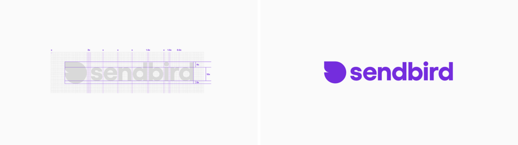
And then came the logo
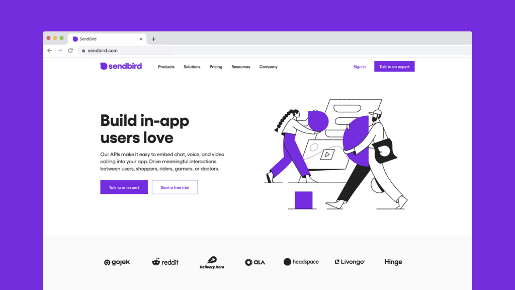
After we defined our brand principles, we started to work on our logo. We were inspired by the side view of a bird … that resembles speech bubbles. Look closely and you’ll see two overlapping speech bubbles. We named this new “Relatabird.” We hope to help make businesses relatable to their customers.
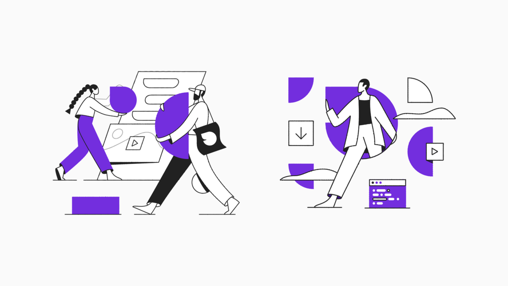
We’ve collaborated with an illustrator for our new illustration style
Humans have been using art to communicate since the prehistoric Stone Age. We set out to find that special artist to tell our story. We chose to collaborate with Amsterdam-based illustrator Timo Kuilder, whose personal style is characterized by uncomplicated color palettes, clean-cut linework and pared-back characters almost reminiscent of Picasso or Matisse. His style is fueled by observing nature and utilizing shapes to tell stories.
What’s next?
We’re never finished learning, growing, and redefining ourselves as we all continue to evolve together. We look forward to working with our customers to help build a more connected humanity in the future.