
How Sendbird Design created our new brand guidelines

Brand isn’t just about design. The thought process behind concocting a brand includes thinking about how a company wants to be seen and felt. It’s also about reflecting upon our true values and aspirations for our customers. Through this journey, we sought to create a brand that best represents who we are and what we do.
Recently, our design team decided to revamp our brand guidelines. We had two main objectives. One was to systemize – to increase work effectiveness within the team through an organized design system. The other was consistency – to strengthen our brand by keeping a consistent brand identity.
As our company grew, so did the Design team,and it was quickly
becoming challenging to provide clear brandguidelines that would scale
with Sendbird through the next phase of growth.
Today, we wanted to share the process behind coming up with effective brand guidelines that provide clarity to our internal team.
Challenges of a fast-growing team
When the design team was smaller, it wasn’t that hard to follow a consistent workflow across the team, as we had regular sync-up meetings. But with our growth and with the team becoming more specialized, we noticed that projects started taking on different, inconsistent styles depending on which designer was working on it. We needed clearer guidelines to ensure consistency acrossr different projects. We wanted to reduce confusion between designers.
The biggest focus for our guidelines was color. We faced challenges of inconsistency in brand identity across projects depending on the different color ratios used by each designer. When we discussed a project we would exchange a lot of feedback sounding like “This doesn’t look like our company’s brand.” But it was hard to explain why it felt so different.
However, we didn’t have documented criteria. And simply providing a color palette at this stage wouldn’t be sufficient. So after hours of meetings and agonizing over the best fix, we came up with the Sendbird Brand Matrix.

The only UIKit you need to build in-app chat.
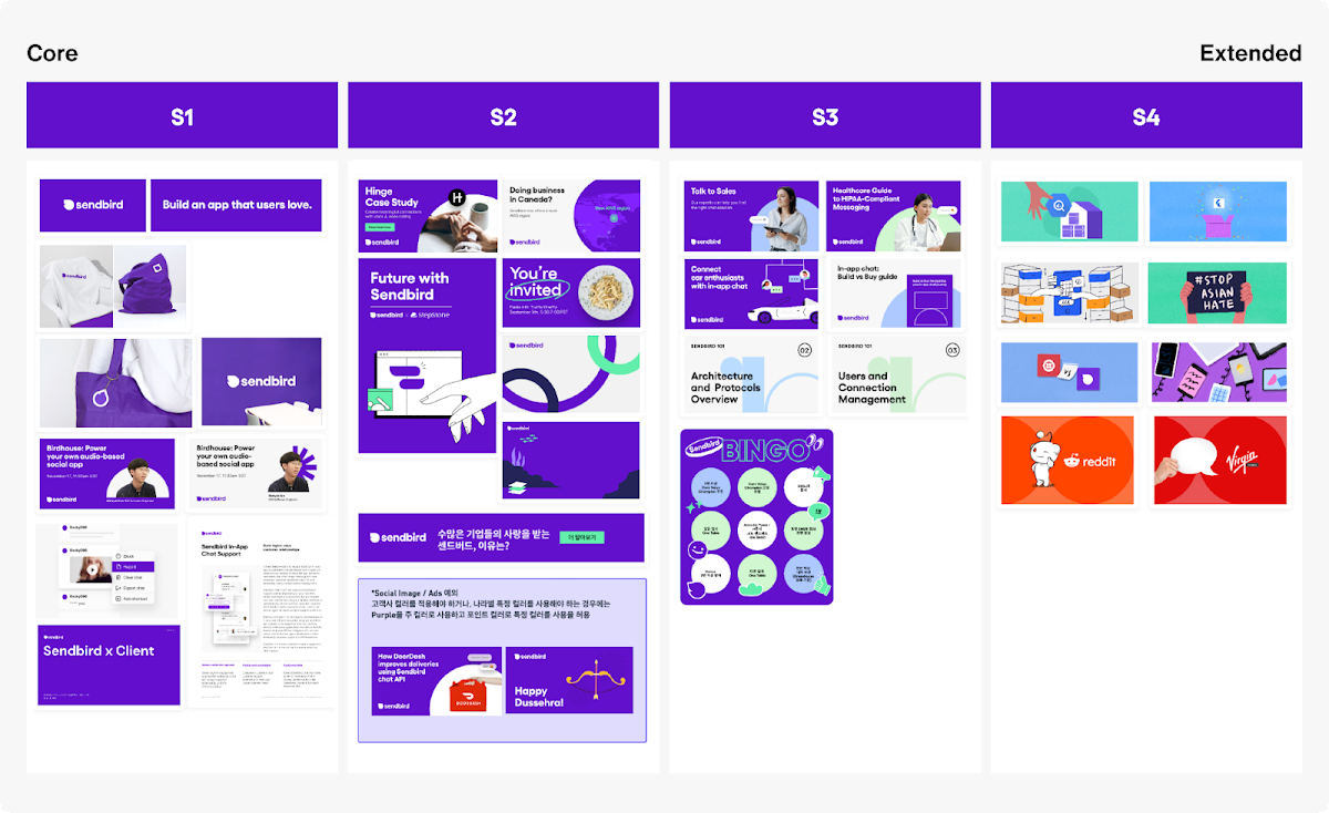
Introducing the Sendbird Brand Matrix
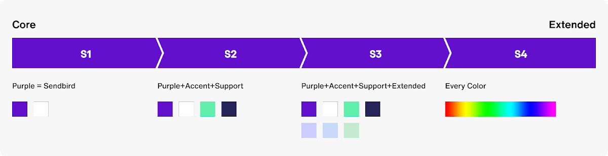
We formed a brand matrix that was divided into 4 categories that would be able to maintain consistency across platforms but still had the flexibility to be used creatively by each designer. Normally as a guideline becomes advanced, a designer’s creative capacity becomes more limited. For us, as much as it was important to keep a consistent tone, we also wanted to enable our designers to freely exercise their creativity.
Step 1
Generally, the main asset that’s first noticed by a user is color. So we took ‘S’ from Sendbird and added a number behind it to create categories of different palettes to be used depending on the importance of exposing our brand identity. S1 would be for projects that needed to emphasize the company’s core brand identity while S4 would be for projects that were exposed to frequent users, allowing for creative freedom in the use of colors.
Step 2
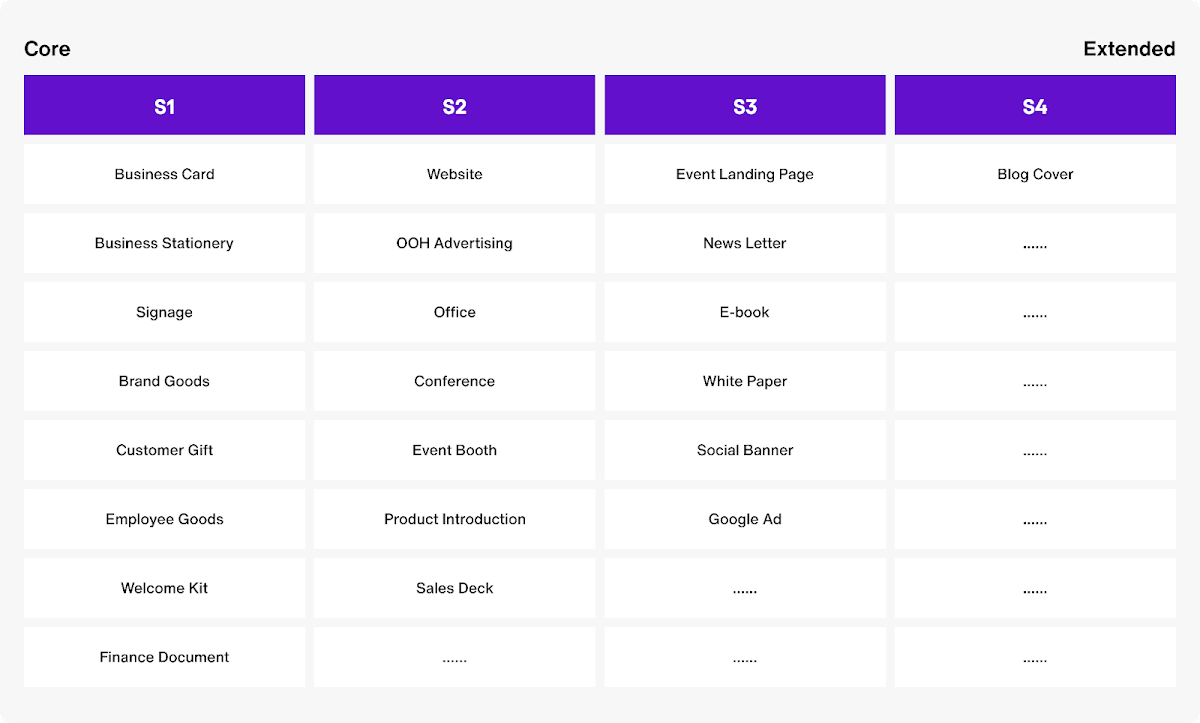
Next, we listed our current design projects and categorized them according to when consumers will be exposed to them. This is so that we could try exposing our extended designs to users who had some recognition of our brand compared to those coming across our brand for the first time.
Step 3
We took screenshots of all our previous projects and categorized them in the four sections of our brand matrix. We tested it and confirmed that the new matrix could indeed serve to be our new guide in our work process.
Step 4
Last, we created a mood board by showing examples of what projects would go under which category. This was so that designers seeing our brand matrix for the first time could easily hop onboard.
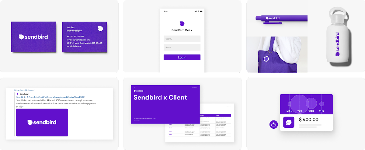
S1: Purple = Sendbird
This is the first stage for users to recognize Sendbird’s brand color – purple. At this stage, it’s important not to create too much of a diversion for users. So we try to limit the use of diverse bright colors and graphics. The color purple is used in places where brand identity is most important such as in business, business stationery, brand goods and finance documents.
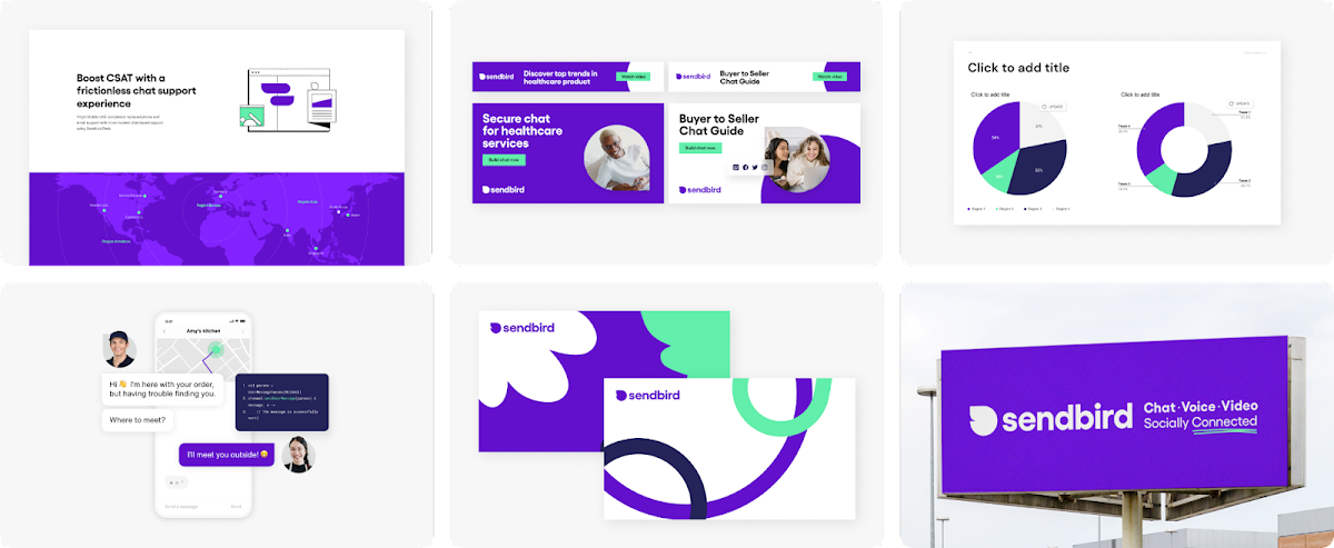
S2: Purple + accent + support
If we continue to just use purple, it becomes increasingly difficult to accentuate what is most important. In the second stage of the Sendbird Brand Matrix, we use accent and support colors to help highlight the main purple color and differentiate information. This helps to keep our brand image but to be able to express other functions. This stage is mainly used in our website, events and ads.
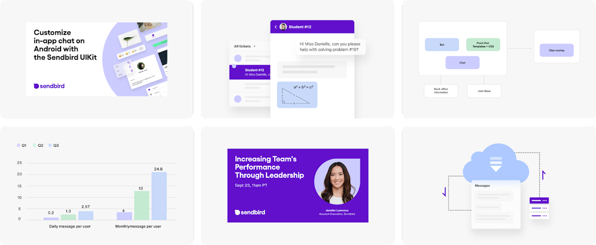
S3: Purple + accent + support + extended Colors
We use a lot of mock up images to effectively deliver our solutions and new functions to users. In order to balance out diverse information given on a single page and to maintain interest, we use not only accents and support colors but a range of extended colors for a more comfortable experience.
In particular, when we need to show graphic elements we tend to apply colors that are pleasing to the eye. The third stage is used when a user has to consume a lot of information such as in e-book and sales deck.
S4: Every color
The last stage is a much more free and extended category than the core. As we were coming up with our brand matrix, we contemplated whether using purple was absolutely necessary in all our projects. We decided that for projects such as blog covers which will be exposed to users who’ll already recognize f the Sendbird brand, it would be best for our designers to be able to express themselves in creative ways by using various colors in their artwork.

So what changed?
After creating the brand matrix, we gave it a test run in our work process across different teams.
Previously, the brand design team would be focused more on highlighting brand identity while the marketing team would be focused on keeping a project vibrant and more captivating for users.The difference in perspective would sometimes stall projects from moving forward.
But with the setup of a guideline in the form of a brand matrix, it helped foster an understanding between the teams to cooperate on a project effectively.
We can’t say that guidelines are a solution to everything. It’s important to create one that’s unique to each companies’ culture and goals. For Sendbird, while currently we have created a brand matrix based on color palettes, we plan to advance the guideline in the future by adding more assets to the categories such as graphic elements and photos.
As we ended up finding a solution fitting Sendbird’s current stage, we are now more confident that we will be able to continue to upgrade our guidelines to suit us along each stage of our journey. We’ll continue to research and discuss the best ways to keep our brand unique. We thank our Design team for coming together to deliver brand guidelines that will support Sendbird through its next stage of evolution.