Creating a Discord clone using Sendbird UIKit

Building a Discord clone: Replicating the functionality and UI of Discord
When you’re looking at implementing a service like Sendbird, one of the things you’ll be looking for is flexibility in shaping the design to match your application. The Sendbird UIKit is built to be highly customizable.
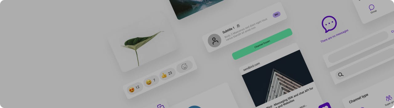
You may be familiar with Discord. It’s becoming increasingly popular as an online communication platform. With its distinguished look and feel, it’s an ideal example to show how we are able to tailor the UIKit to go with its theme. If you’ve used Discord then you know there are chats based around a large topic or chats that contain a small group of individuals.
In Sendbird, we call those an Open Channel and a Group Channel. While there are many similarities between Sendbird and Discord, there are also differences that make them unique.
For example, with Sendbird, the possibilities for customizing UIKit are endless. You’ll be able to go beyond what’s provided to you and build a chat that will support your creative vision.
UIKit default vs. Discord example
It’s important to understand which UIKit features you would like to include for users to have access to, the components you do not need, and the visual theme you are looking to implement. After you know what’s necessary for your desired application and have a layout to reference, you can find the specific UIKit components that provide you with each feature.
For this Discord example, there will be a Channels List with both Group Channels and Open Channels. Depending on the type of channel being clicked on, the conversation window will render the Open Channel or Group Channel view. Since these are two separate components that have distinct default formats, we have to take different approaches depending on the component we are working with in order to produce the same output.
Getting started with your Discord clone
First, create a new application in your Sendbird dashboard. Within that application, create a user, an open channel, and a group channel. On the left-hand sidebar, in the ‘Overview’ tab you can find the application ID. Below ‘Overview’, go into the ‘Users’ tab to create your user and access their information which includes the user’s ID, nickname, and access token. These are all key variables you will need to include in your application later on in order to make it run. Learn more about these initial steps on how to send your first message.
Open your application and install the Sendbird-UIKit with ‘npm install sendbird-uikit –save’. Upon installing the UIKit, create a .env file where you will export your application ID, user ID, user’s nickname, and user’s access token provided from the application you created in your dashboard. These variable names must start with “REACT_APP” (e.g. REACT_APP_APP_ID). The application ID, user ID, nickname, and access token will then be imported into your App.js file.
The three overarching components that will be focused on are the channel list, conversation window, and channel settings.
Step 2: Create an Open Channel
To allow users to create a new Open Channel, we’re going to create a button that will render a form where users can input the new channel’s name and generate the channel once they submit it. To do so, we’ll first add a button in the CommunityChannelList and on click of the button render the custom component, AddCommunityChannel.
AddCommunityChannel will return the form to create a new Open Channel. By understanding how GroupChannelList renders its form to create a new Group Channel, we can utilize that same code from the UIKit and keep what’s necessary for our Open Channel form. Below are the alterations made to fit our Open Channel form:
To create a new Open Channel, we utilize the createChannel function provided specifically for Open Channels. This can be seen in the above code on lines 19 – 24.
Rendering Open Channel conversation
After the AddCommunityChannel component, the next component returned in the CommunityChannelList is OpenChannelPreview. This component provides the layout for how each channel is displayed within the channel list.
Channel list footer
In the CommunityChannelList after OpenChannelPreview, we’ll insert our footer and tweak the default layout to render a custom component, Profile. Profile will display the current user’s information in a layout that aligns with Discord by showing the current user’s avatar, name, and ID number.
Step 3: Add custom implementations
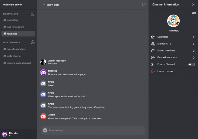
Since Group Channels and Open Channels differ in their layouts, we’ll create two separate CSS files. When we look at the UIKit, we can see there are necessary CSS adjustments to implement along the way in order to shape it like Discord. For our channel list, we apply styling to replace each channel’s avatar with ‘#’ and ensure all channel names listed are lowercase.
The color scheme will consist of shades of gray and white. The sidebars are darker gray, while the conversation window is a lighter gray. By having Discord open in another window, it will help point out the differences to take note of what format changes should be made.
Step 4: Implement channel conversation
The next section of the page layout is the channel conversation window. In CustomizedApp, following the Group Channel List and Open Channel List, it will return either the GroupChannelConversation or OpenChannelConversation component depending on which type of channel is being clicked on. This can be seen below within the conversationChatWindow function.
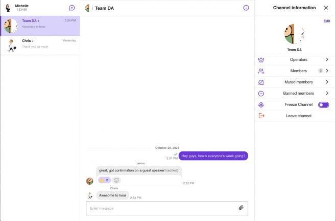
Group Channel conversation
GroupChannelConversation returns the Channel and ChannelSettings component from the Sendbird UIKit.
Channel, which is referred to as SBConversation in this file, renders the chat window. When calling this component, it needs to use channelUrl to set the current channel and its onChatHeaderActionClick function to create a custom action on the click event for the icon button in the header. When calling this function, it’ll toggle to open and close the channel settings sidebar.
SBConversation also utilizes the renderChatItem prop, which returns our CustomizedMessageitem component. CustomizedMessageitem returns either a FileMessage, UserMessage, or AdminMessage component, which each displays different designs of a message based on the type of message that it is.
ChannelSettings, which is referred to as SBChannelSettings in this file, is rendered if the user clicks to open the channel’s settings. This component will pass in the current channelUrl and use its onClickClose function to hide the settings bar.
Open Channel conversation
OpenChannelConversation contains the OpenChannel and OpenChannelSettings components from the UIKit. OpenChannel renders the Open Channel’s conversation that is clicked on and structures how the chat window appears. OpenChannelSettings is the component for how the channel’s settings are rendered.
Step 5: Add conversation customizations
After implementing both types of channels’ conversation window and settings sidebar, we can begin working on fixing the design.
For both channel’s conversation headers, we want to apply the same previous CSS to clear the channel’s avatar, replace it with ‘#’ before the channel name and have the channel name displayed in lowercase. Both Group Channel and Open Channel conversations contain an input bar to send a message. Within the input bar, we’ll move the button for users to add file attachments onto the left side and make additional CSS format tweaks as well.
Group Channel conversation customization
For Group Channel conversations, when we look at the conversation window, the message format in Discord is different from the UIKit. The default conversation layout has incoming messages on the left-hand side, while the current user’s messages being sent are on the right side. Here we’ll implement custom CSS to override the default styling and have all messages aligned on the left side, remove the chat bubble around messages and the background color, and include the current user’s avatar and name next to their message.
While the UIKit provides Open Channel messages to have a built-in options button on the right side of every message being sent or received, the Group Channel’s messages do not provide that button. We want to provide the same functionality for the Group Channel messages so we will go ahead to implement that.
Using the same dropdown menu layout that Open Channel utilizes, in the Group Channel’s message we’ll create a button that renders the dropdown options. We want to put the dropdown inside of our UserMessage component that handles the format of how our user messages are displayed. Below shows how the dropdown is placed in UserMessage:
For Group Channels, there can be a case where an Admin enters a message. Here the AdminMessage component is rendered, and we alter this file to set a custom avatar image for all admins to have so it isn’t blank.
Open Channel conversation customization
For Open Channel conversations, it naturally has more of an overlap with the Discord layout. The key CSS changes made are for the color scheme and font format.
You've built your own Discord clone!
With the flexibility of the modularized Sendbird UIKit, we can build feature-rich in-app chat, and design it to fit our vision for our application. We strongly recommend that you check out the sample code when building your Discord clone. If you need help with the material in this Discord clone tutorial, please check out the docs or visit the Sendbird Community. If you need more assistance, please contact us. Our experts are always happy to assist!
After you're happy with your final project, take it to the next level by adding calls to your Discord clone!
Remember that if you're new to Sendbird, it’s easy to get started with various chat SDKs for the client side and a chat platform API for the server side. Check out the developer portal which contains a wealth of tutorials on how to get started with chat, calls, and live streaming. Send your first message today.
Have fun building your Discord clone! ✨