
Driving business success with mobile-friendly web apps and sites


Alongside your app, your website is the most important aspect of your business. How else will companies find you and move through the buyer's journey?
It isn’t enough just to have a website, though, it needs to be fully optimized and responsive for any layout or page type. Specifically, your site needs to be optimized for mobile.
Mobile-friendly websites are essential because everyone uses the web on mobile. 92.3% of us, in fact.
In this blog, we’ll go over why optimizing for a mobile website is necessary for the success of your business and how Sendbird’s UIKit can help you build one (or help improve your existing one).
Mobile usage statistics
With the exponential growth in mobile device usage for internet browsing, businesses must optimize their websites and web apps to deliver a seamless experience to mobile users.
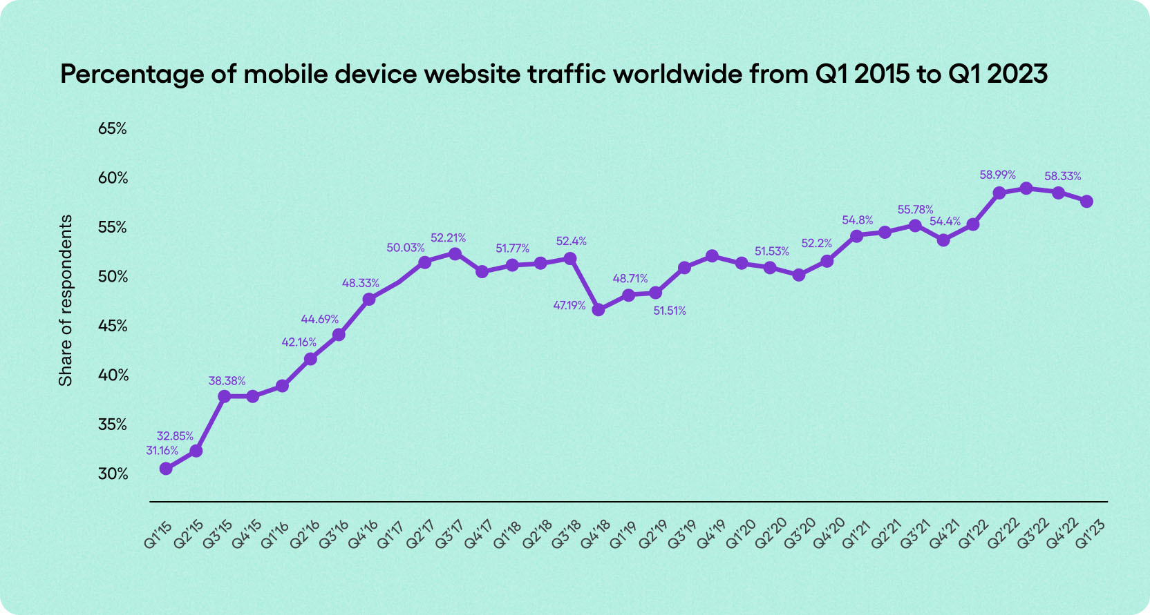
Mobile has become an integral part of our daily lives, serving as a primary tool for accessing the internet. Statistics reveal a significant increase in mobile usage, with a large portion of web traffic originating from smartphones and tablets. People using mobile devices contributed almost 60% of all website traffic in Q1 of 2023, according to Statista.
For businesses, this shift in consumer behavior highlights the need to cater to mobile users. Failure to do so can result in missed opportunities, reduced engagement, and ultimately, loss of potential customers.
By adapting websites and web apps to the mobile landscape, businesses can tap into the growing mobile user base and ensure their online presence remains accessible to all.
92.3% of internet users access the internet using a mobile phone.
There are approximately 4.32 billion active mobile internet users.
People using mobile devices contributed almost 60% of all website traffic in Q1 of 2023, according to Statista.
Conversion rates on desktop only beat out mobile by 1% in 2022.

The only UIKit you need to build in-app chat.
The best practices for mobile optimization
To ensure your website is mobile-friendly and delivers the best possible experience to mobile users, it's essential to follow some best practices.
Start by implementing responsive design, which allows your website to adapt seamlessly to different screen sizes and orientations.
Optimize page load speed by minimizing file sizes, leveraging caching techniques, and optimizing images.
Simplify navigation and ensure that buttons and links are easy to tap on smaller screens.
Prioritize mobile-friendly content that is concise, readable, and visually appealing.
Test your website and web apps on different mobile devices and browsers to identify any issues and make necessary adjustments.
Regularly monitor and analyze mobile traffic and user behavior to gain insights and optimize your mobile strategy continually.
Reasons to focus on your mobile website and web apps experience
By embracing mobile optimization and following best practices, businesses can ensure their online presence remains accessible and engaging across devices.
Here are three reasons to improve your mobile experience:
Valuable SEO benefits
Mobile optimization is about delivering a better experience to users and meeting search engine requirements. Google, for instance, favors mobile-friendly websites in search results, as it aims to prioritize websites that cater to the increasing number of mobile users. With a mobile-friendly website, businesses improve their chances of ranking higher, driving more organic traffic and visibility to their site.
It's essential to note that a separate mobile version of your website is not required; responsive design can efficiently cater to both desktop and mobile users, providing a seamless experience across devices.
Higher conversion rates
While desktop leads tend to convert more, you need a fully optimized mobile experience to ensure mobile customers stick around.
And who’s to say this trend remains the case? With social moving toward pushing shoppable links and e-commerce leading the way with live selling, it is completely possible for your mobile conversion rates to surpass your desktop ones.
Users who have a positive experience on a mobile site are more likely to engage and convert into customers. Mobile optimization ensures that crucial elements such as clear calls-to-action, streamlined forms, conversational interfaces, and mobile-friendly checkout processes are in place. Mobile users often have specific needs and behaviors, and businesses that can address those needs effectively will have an edge in converting mobile visitors into customers. By removing any barriers or frustrations in the mobile user journey, businesses can increase conversion rates and maximize their return on investment.
Mobile-friendly websites have a competitive advantage
In a highly competitive digital landscape, having a mobile-friendly website provides a distinct advantage over competitors who have not yet optimized their sites for mobile devices. If a business fails to provide an optimized website in this day and age, users will quickly move on to competitors who do.
Building a unique and branded web mobile-friendly experience
If you want your brand to engage effectively with customers, check out Sendbird’s React Chat UIKit, an easy-to-use chat solution for the web that includes pre-built user interface (UI) components to reduce development time. It is ideal for building a world-class, custom, and branded chat experience on your website that will work both on desktop computers and mobile devices.
To invest even more in conversational engagement, choose Sendbird, the most proven and feature-rich communications API platform for websites and apps. Sendbird offers powerful APIs for chat, calls, and more.
Remember, a mobile-friendly website is not just about accommodating mobile users; it's about delivering exceptional experiences that drive business growth and keep you ahead of the competition.