A tour of Sendbird's React UIKit: The essential components & modules you need to know

Build a streamlined chat UI with a React UIKit
Building in-app chat is a fascinating but complex endeavor. Whether you’re building for gaming, retail, digital health, or on-demand, it is necessary to have a streamlined chat UI for your web or mobile app. Sendbird's React React UIKit makes it easy to implement an intuitive chat UI. Sendbird's React UIKit provides the resources to build a functional and attractive chat experience with pre-built chat UI components from the Sendbird SDK. Sendbird's React UIKit is useful because it’s critical for developers to be able to select the elements necessary to build a feature-rich, streamlined chat app the way you envision it.
In this tutorial, we will learn about the components of Sendbird' React UIKit, as well as each of their use cases. By the end of this tutorial, you will understand how to implement these components to create your own custom integration.
You may also find the following video tutorial useful.
React UIKit: Setting up the environment
To start, create an application on the Sendbird dashboard. This is where you can access everything necessary for your chat service, including your applications, users, messages, and channels. Once you create an application, you will need the App ID to initialize the Chat SDK.
Next, create a new project environment using create-react-app. Then add a .env file to store the App ID, user ID and nickname that was generated from your Sendbird dashboard. Now, install Sendbird UIKit through npm or yarn:
Once the React UIKit is installed, we want to implement it in the application by using components. The first one we’ll learn about is the App component.
App component
The App component is a collection of UI components that create a functional chat interface. App, or the App component, will render a view containing a channel list, channel conversation, and channel settings all within one component.
To use this, import the UIKit component SendbirdApp and the UIKit stylesheet in the App.js file:
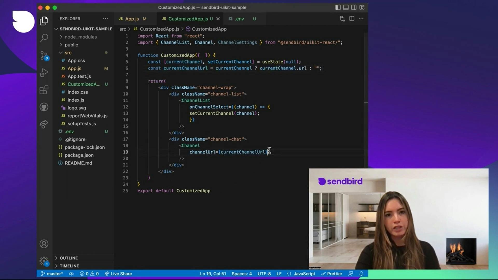
The App component requires an application ID and user ID to be passed in. The following code depicts how you would use the App component:
Then, specify the height and width for the chat interface in the stylesheet:
Make sure to import this stylesheet in the App.js file.
At this point, we have a successfully running chat application in which you can create a new channel and send messages. It should look like this:
If you would like to customize your chat experience, you do this by using the core components and modules provided by UIKit. First, let’s dive into the core components.
Core components in the React UIKit
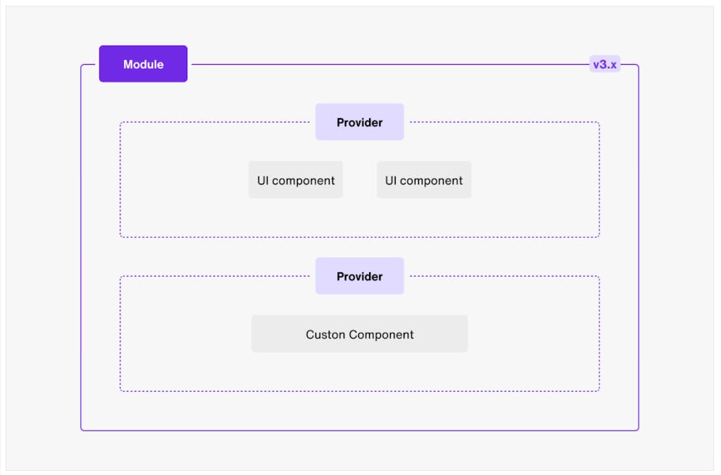
The core components are the main building blocks of UIKit. The core components include the SendbirdProvider, sendbirdSelectors, userSendbirdStateContext, and withSenbird(). Each of these store and operate upon all of the data necessary to run an application.
How do the core components work? They get data from the Chat SDK instance, connect to the Sendbird server, talk to the modules for events occuring in the view, and configure features and localization. These components work to create and execute views; however, they don’t provide or display a UI. That’s where the modules come into play: the modules provide a UI view for the core component being used.
The SendbirdProvider is the most important core component because it provides context and passes the Chat SDK data as well as current state down to any child components. The SendbirdProvider needs to be at the top level so the entire application has access to Sendbird data.
With SendbirdProvider, we’re able to use the useSendbirdStateContext() component to implement the Sendbird Chat SDK for Javascript in child components of SendbirdProvider. The useSendbirdStateContext component will allow us to access the state of SendbirdProvider, hook into SDK actions, and can be used with sendbirdSelectors to implement functionalities like sending or updating a message.
Before the UIKit v4, the withSendbird() component was used to pass data between the Chat SDK and the modules, but with the UIKit update, we recommend that you use useSendbirdStateContext() instead.
Lastly, the sendbirdSelectors are used to perform data operations and give you access to the SDK. The main selector functions include getSdk, getCreateOpenChannel, and getDeleteMessage.
Handlers
UIKit provides various event handlers to manage activities and events that occur in the client app. Since the upgrade from v3 to v4 in the Chat SDK, UIKit implemented channel event handlers that can be imported instead of calling the channel handler from the sdkInstance. The channel event handlers include ConnectionHandler, GroupChannelHandler, OpenChannelHandler, and UserEventHandler. Next, the SDK uses session handlers to renew a session token. A session token is used to securely authenticate a user when the Chat SDK connects the user to the Sendbird server where they can send data requests to it before the token expires.
Modules in the React UIKit
Now that we learned about the core components of UIKit, it is important to learn about modules and how each module works in conjunction with core components. Modules operate as smart components that provide a customizable UI. These modules contain providers and pre-built UI components that create a functional chat view.
The eight modules in UIKit are:
- Channel list
- Create a channel
- Group channel
- Group channel settings
- Open channel
- Open channel settings
- Message search
- Edit user profile
Each module has a context provider and a set of UI components. The provider manages the necessary data from the Chat SDK while the UI components render the interfaces to display the view of the module. To pass data between the provider and UI components, we utilize a useContext hook. The context hooks must be inside the provider in order to allow every UI component to have access to the data from the provider. While there’s a default set of UI components for each module, all UI components are customizable by setting the input props with custom components.
ChannelList
The ChannelList shows a list of group channels the current user is a member of. Some of the ChannelList’s properties include onBeforeCreateChannel, onChannelSelect, and renderChannelPreview.
The onBeforeCreateChannel and onChannelSelect properties allow you to perform actions as the user interacts with UIKit’s user interface. The renderChannelPreview property allows you to replace the default UI of the channel preview with your own customized component. This can be used to set the channel preview to simply have the user’s nickname displayed in the channel list.
The context provider used for this module is the ChannelListProvider. This provider manages the logic and data used in the channel list view. So, if your application only requires to view a channel list, you can use the ChannelList module to display the view of a channel list and have that module wrapped inside of the ChannelListProvider, which will pass any necessary data down to the ChannelList.
You could also use the useChannelListContext hook to get access to the provider’s data. Some of useChannelListContext’s properties are initialized, loading, and currentChannel.
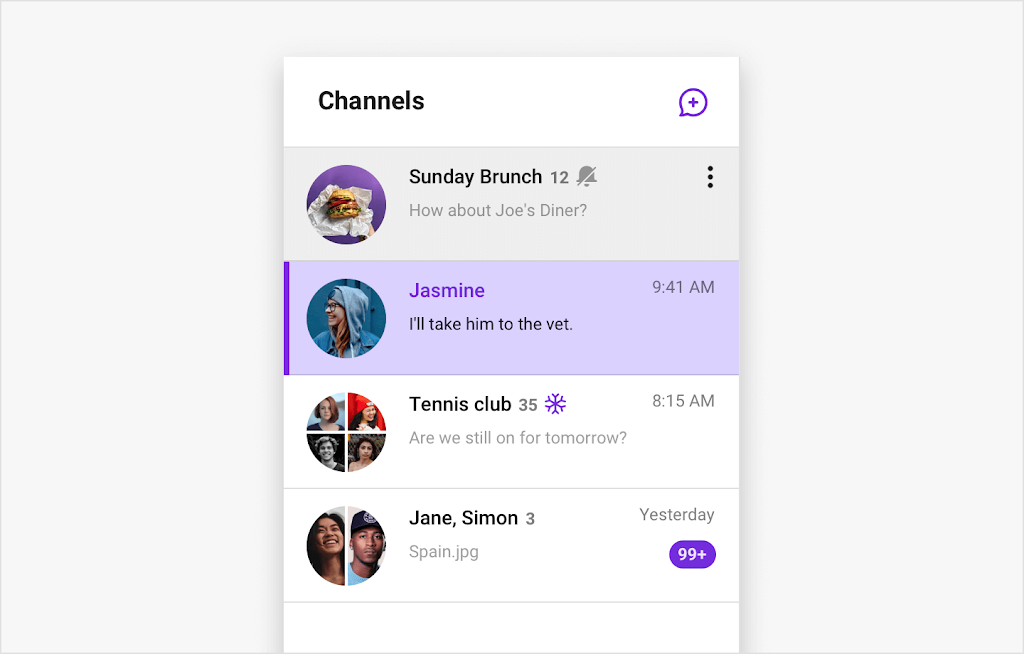
The UI components that make up the ChannelList view are ChannelListUI, ChannelListHeader, and ChannelPreview. The ChannelListUI shows the basic screen of the module, including the headers and channel preview. It includes a list of properties to use such as renderHeader, renderPlaceHolderError, and renderPlaceHolderLoading. The ChannelListHeader is the header of ChannelListUI which displays the title and a button to create a new channel. Three properties to utilize with this UI are renderHeader, renderIconButton, and allowProfileEdit. The ChannelPreview UI component shows a single channel in the channel list. The properties for ChannelPreview are channel, onClick, renderChannelAction, and isActive.
Here is how you can implement the ChannelList using the ChannelListProvider and useChannelListContext:
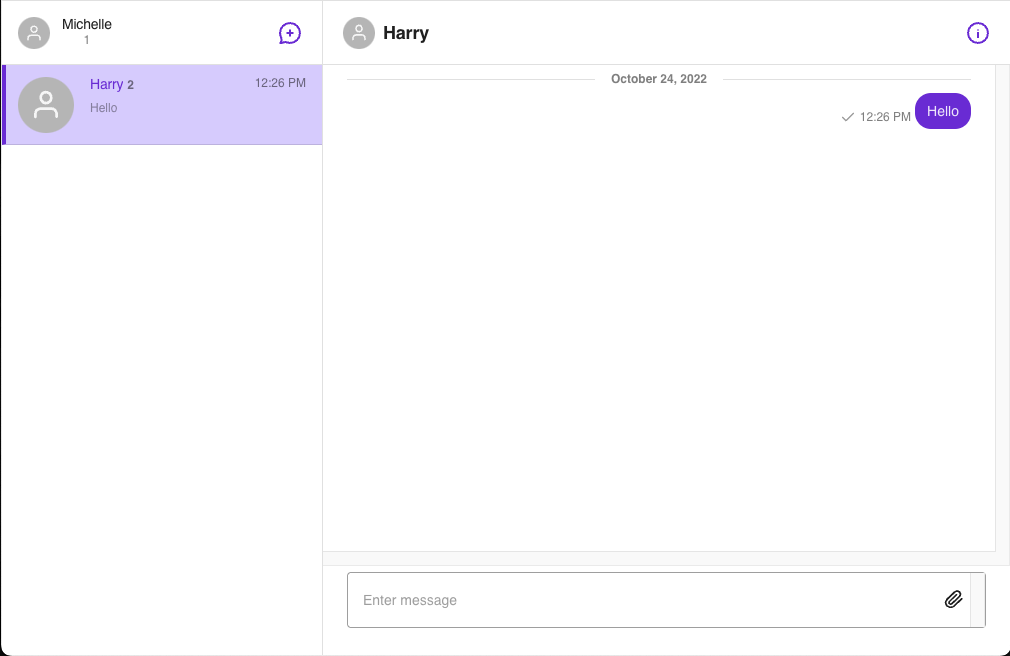
This is the ChannelList component’s default design:
CreateChannel
The CreateChannel module is used to create a new group channel. CreateChannel requires the channelUrl property to be passed into it. Additional optional properties include onBeforeCreateChannel, onCreateChannel, and onCancel. All three of these properties execute on certain actions within UIKit’s user interface, enabling you to pass in and run your own set of operations.
For instance, you can use onBeforeCreateChannel to trigger a function to be called as the user clicks to create a group channel and before it generates a new channel. The function called, for example, could set the group’s image for the channel being created. Using the onCreateChannel property will allow you to implement an action right after the channel is created. You may use this to render a success message onto the screen once your channel is created. If you want to trigger an event when the ‘cancel’ button is clicked, you can use the onCancel property. You can choose to implement your own custom UI from here and call a function to render a view asking if you are sure you want to cancel creating the channel.
The two context objects that can be used to create a group channel and pass data from the provider to the UI components are the CreateChannelProvider and useCreateChannel hook. CreateChannelProvider requires the channelUrl property to be passed in. Additional optional properties are children, onCreateChannel, onBeforeCreateChannel, and queries.applicationUserListQuery.
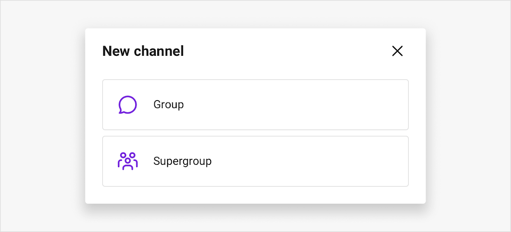
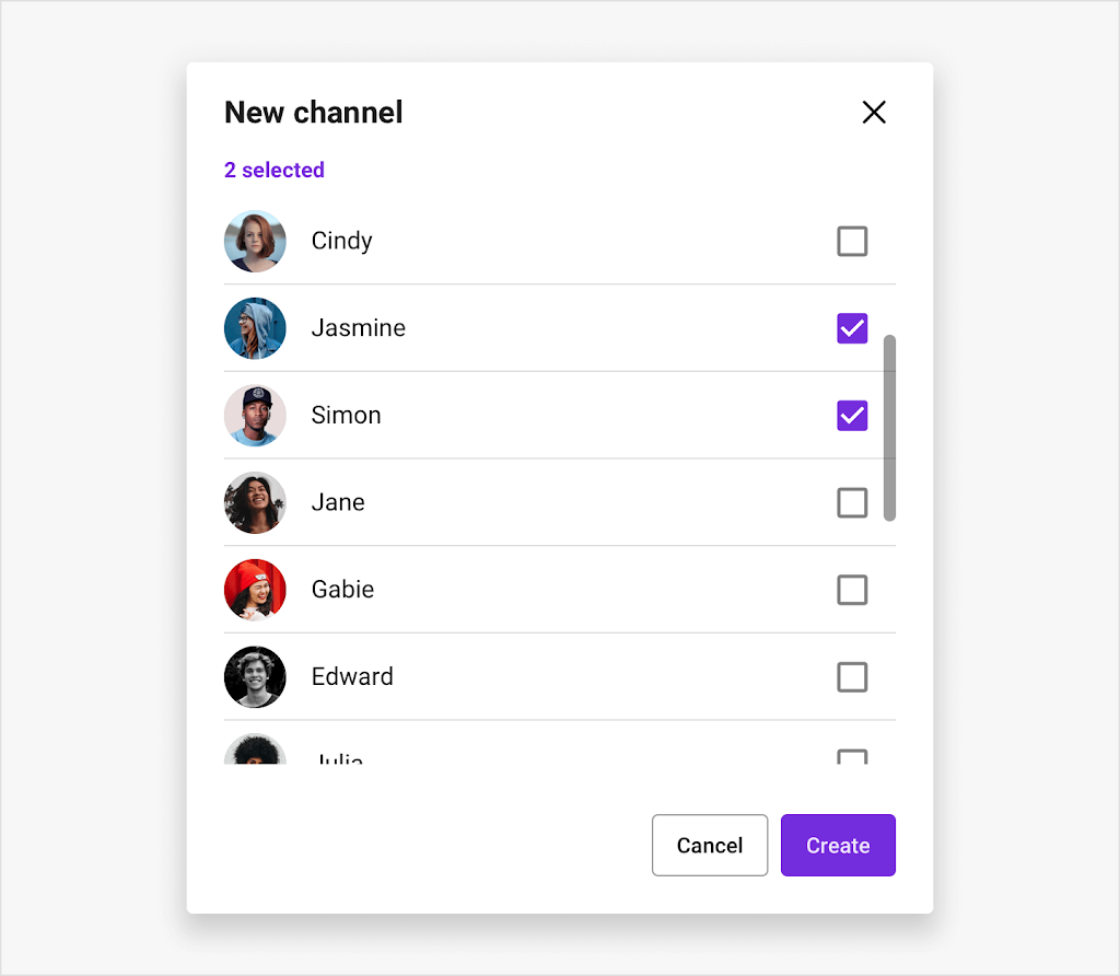
The UI components that compose the CreateChannel view are CreateChannelUI, InviteMembers, and SelectChannelType. CreateChannelUI and SelectChannelType are used together to show the first step of CreateChannel module. InviteMembers displays the second step after the channel is created. CreateChannelUI has onCancel and renderStepOne properties. SelectChannelType renders the view where the current user can choose which type of channel to create. InviteUsers displays a view where the current user can invite other users to join the channel. Both SelectChannelType and InviteMembers have an onCancel property.
The following code shows how to use CreateChannel module with the CreateChannelProvider and useCreateChannel hook:
Below is the default layout of the CreateChannel module:
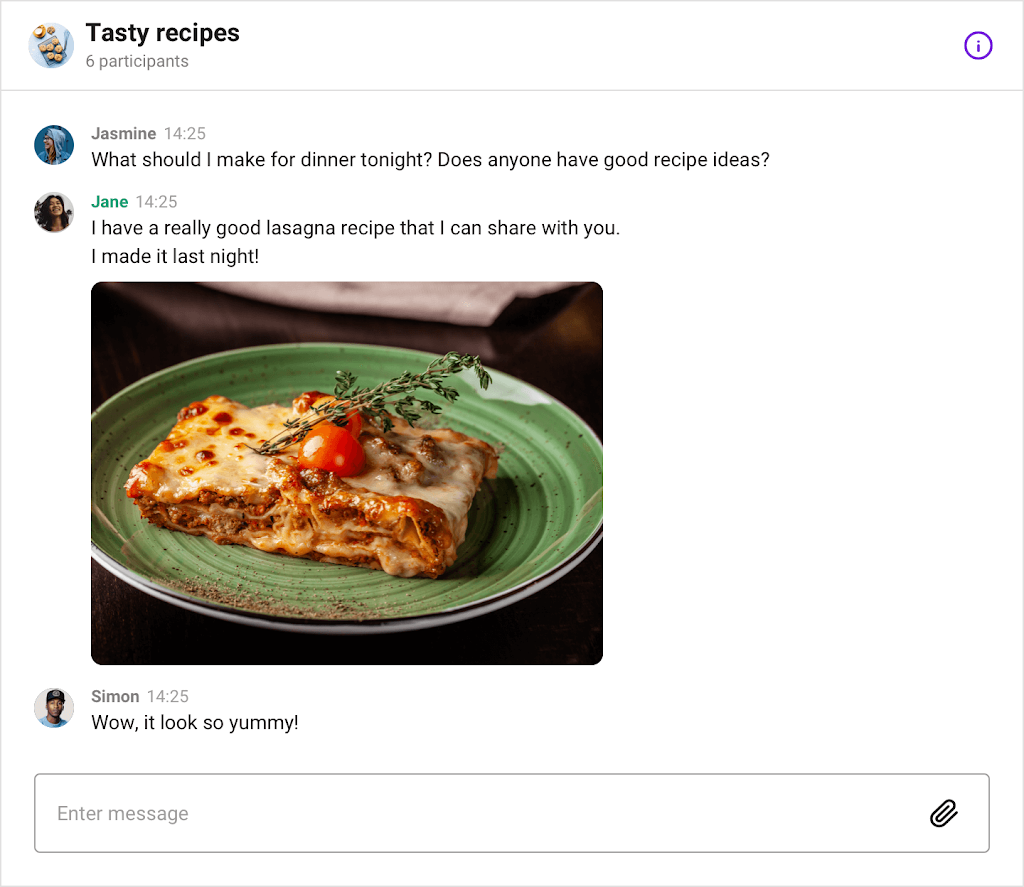
Channel
The Channel module displays a group channel conversation. Users can access a group channel only if they are invited to be a member in the channel. This module requires a channelUrl property to be set. Other optional properties include isReactionEnabled, showSearchIcon, and onBeforeSendUserMessage.
The isReactionEnabled and showSearchIcon properties control whether or not the feature is being used and displayed. The property onBeforeSendUserMessage can be used to execute custom logic in the background when the user clicks to send a message, but complete the operations before the message is sent to the channel. Therefore, on click of sending a message, it will trigger the function you pass in to complete an action, and then send the message. This can be useful in a case where you want to check the message’s text being sent and if it contains a specific word, then trigger an animation to go off as the message is then sent.
The two context objects used to store and manage the data used to build a group channel are the ChannelProvider and useChannelContext hook. The ChannelProvider requires a channelUrl property and includes additional properties such as isMessageGroupingEnabled, isReactionEnabled, and highlightedMessage. The useChannelContext context hook ‘s optional properties include channelUrl, startingPoint, and onBeforeSendFileMessage.
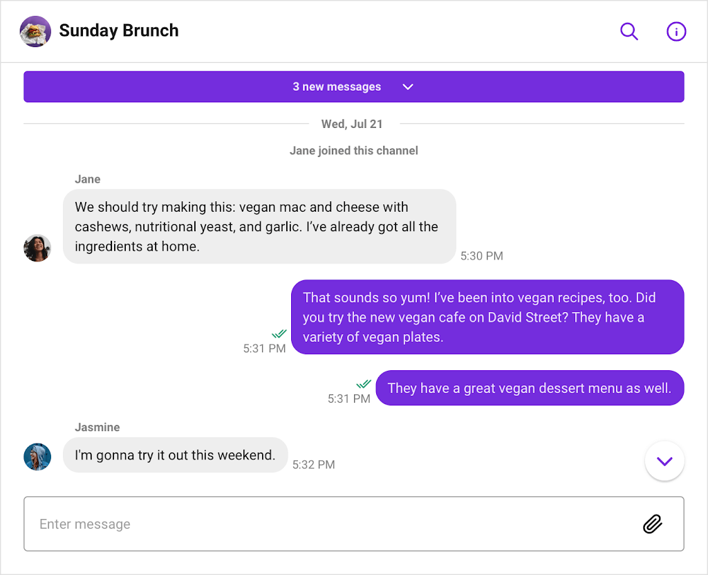
The UI components in the Channel module are ChannelUI, ChannelHeader, MessageInput, MessageList, FileViewer, FrozenNotification, Message, RemoveMessageModal, TypingIndicator, and UnreadCount. ChannelUI displays the basic screen of the module and has a number of properties such as renderPlaceholderLoader, renderMessageInput, and renderTypingIndicator. ChannelHeader is the header of the ChannelUI component that shows the channel title, a message search icon, and a channel information icon. MessageInput is the component in which users can enter a message or send a file message.
MessageList displays a list of all the messages in a group channel and has three properties: renderMessage, renderPlaceholderEmpty, and renderCustomSeperator. FileViewer shows all messages containing image or video files and has two optional properties: onCancel and message. FrozenNotification is a component that displays a banner alerting users that the current channel is frozen.
Message is a component within the MessageList that shows a single message in the channel. It requires a message property and has additional optional properties such as hasSeperator, chainTop, and renderEditInput. RemoveMessageModal shows a modal confirming the selected message will be deleted from the channel and has two optional properties: onCancel and message. TypingIndicator displays which member in the channel is actively typing a message. And lastly, UnreadCount displays how many unread messages are in a channel. The properties of UnreadCount are count, time, and onClick.
The following code is how to implement the Channel module using the ChannelProvider and useChannelContext:
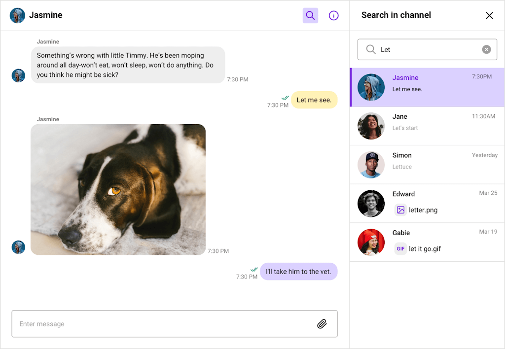
This is the Channel component’s default layout:
ChannelSettings
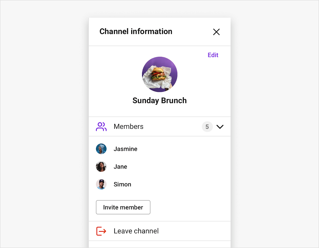
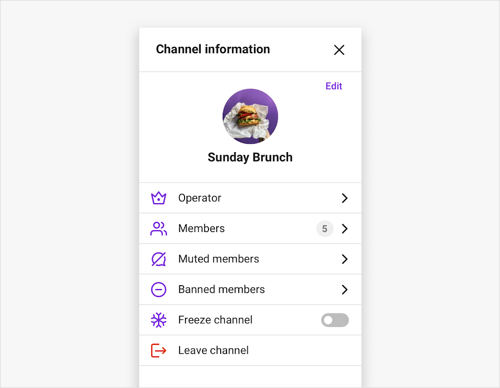
The ChannelSettings module displays a menu of group channel information and settings options. Members can check out a member list, invite a user to the channel, and leave the channel. If the user is a channel operator, then they’ll have additional options available to them (in the settings), such as being able to add or remove operators, mute or ban members, see a list of muted and banned users, and leave or freeze the channel.
The ChannelSettings requires a channelUrl property and has optional properties such as onCloseClick, onChannelModified, and renderLeaveChannel. The onCloseClick and onChannelModified properties are triggered by an event fired from the UI itself and execute the custom logic you pass in. You can utilize onCloseClick in the event where a user clicks the button to close the settings bar. You can pass it a function where you want to modify the UI to not display the settings component. If you would like to fire an event once the settings are changed, you can render a success message to the screen by utilizing the onChannelModified property. When using ChannelSettings, you may want to change the ‘leave channel’ button design. You can do so by using the renderLeaveChannel property with which you can pass in your own custom UI to the settings module.
The two context objects to build a channel settings menu for this module are the ChannelSettingsProvider and useChannelSettingsContext. The ChannelSettingsProvider requires a channelUrl to be passed in. Some other options for this provider are onCloseClick, onBeforeUpdateChannel and invalidChannel. The useChannelSettingsContext hook has multiple properties that can be used, such as onCloseClick, onChannelModified, and onBeforeUpdateChannel.
The ChannelSettings set of UI components that compose the group channel settings view are ChannelSettingsUI, ModerationPanel, UserPanel, ChannelProfile, EditDetailsModal, LeaveChannel, and UserListItem. ChannelSettingsUI displays the view that includes the channel profile view, moderation menu view, and leave channel button. The component has four optional properties: renderPlaceHolderError, renderChannelProfile, renderModerationPanel, and renderLeaveChannel. The ModerationPanel creates the settings menu view for channel operators. This includes a list of operators, members, muted and banned users, a freeze channel toggle button, and the option to leave the channel.
The UserPanel component creates the settings menu view for channel members which includes a list of members, option to invite other users to the channel, and an option to leave the channel. The ChannelProfile component creates the channel profile view including the channel title, image, and edit button allowing users to change channel information. EditDetailsModal displays a modal where users can edit the channel name and profile image. It has two optional properties that can be used: onSubmit and onCancel.
The LeaveChannel modal renders when a user clicks to leave the channel in the settings menu and asks the user to confirm this action. LeaveChannel has an onSubmit and onCancel property that can be used with it. The UserListItem displays an individual user within a user list. This component requires a user property to be set and has three optional properties: currentUser, className, and action.
Here is how you implement the ChannelSettings module using the ChannelSettingsProvider and useChannelSettingsContext:
This is the ChannelSetting’s default UI for non-operators:
This are the channel settings that will be displayed for channel operators:
OpenChannel
An open channel is a public channel that can handle a large number of users interacting within a chat. The OpenChannel module requires a channelUrl property and has a range of optional properties such as children, isMessageGroupingEnabled, messageLimit, and renderUserProfile.
The children property shows the child components of the OpenChannel, which is data provided by the OpenChannelProvider. The isMessageGroupingEnabled property checks if the feature is activated so that it knows how to display the UI. If message grouping is enabled, each message that is sent within one minute will be grouped into one message. The messageLimit property provides the maximum number of messages that will be stored in the OpenChannelMessageList component of the channel. If you would like to customize the profile preview when clicking a user’s avatar, you can pass in your own UI component by using the renderUserProfile property to override the default design.
The context objects that can be used for the OpenChannel module to store and handle data are the OpenChannelProvider and useOpenChannel hook. The OpenChannelProvider requires a channelUrl property to be set. Some optional properties include isMessageGroupingEnabled, messageLimit, and onChatHeaderActionClick. The useOpenChannelContext context hook has a number of properties that can be utilized, such as renderUserProfile, currentOpenChannel, and allMessages.
The set of UI components that make up the OpenChannel module are OpenChannelUI, OpenChannelHeader, OpenChannelInput, OpenChannelMessageList, and OpenChannelMessage. OpenChannelUI displays the basic screen of the module and the view of the header, message, and message list in an open channel. OpenChannelUI has a list of optional properties such as renderMessage, renderHeader, and renderInput. OpenChannelHeader renders the channel title and information icon. OpenChannelInput is where users can send a message or file message like an image, video, or document.
The OpenChannelMessageList displays a list of all the messages in an open channel. It has two optional properties: renderMessage and renderPlaceHolderEmptyList. OpenChannelMessage shows the individual message in the channel. This component requires a message property and has a number of optional properties such as hasSeperator, chainTop, and editDisabled.
Below is how to use the OpenChannel module with the OpenChannelProvider and useOpenChannelContext:
This is what the OpenChannel’s default design looks like:
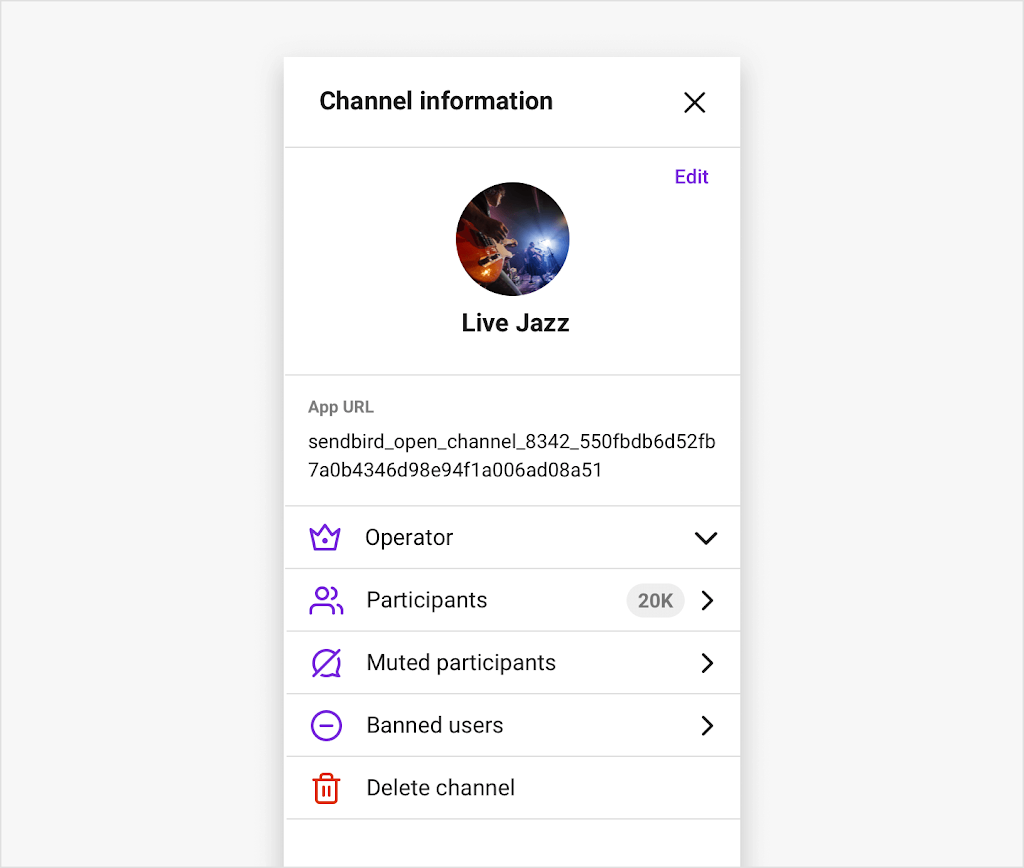
OpenChannelSettings
The OpenChannelSettings module shows a menu of settings such as providing the channel name, image of the channel, the application URL, and a list of participants. If the current user is an operator, they have additional settings such as adding or removing operations, viewing a list of muted and banned users, being able to mute or ban participants, and an option to delete the channel.
OpenChannelSettings requires a channelUrl property to be passed in. A few other properties provided are onChannelModified, onDeleteChannel, and onCloseClick. These properties will run a set of operations as the user interacts with specific attributes in the UI. In the open channel settings, by using onCloseClick, you can set the state of the settings bar to be closed and remove the settings component from the chat view. The same idea applies when using onChannelModified and onDeleteChannel, where if the user clicks to save any edits they have made or if they click the button to delete the channel, you can modify the UI in your application to have a custom component to appear on the screen.
The two context objects used to build a functional channel settings menu are the OpenChannelSettingsProvider and useOpenChannelSettingsContext hook. The OpenChannelSettingsProvider requires a channelUrl to be passed in and includes additional properties such as onBeforeUpdateChannel, disableUserProfile, and renderUserProfile. The useOpenChannelSettingsContext hook has a list of properties such as onDeleteChannel, onChanelModified, and setChannel.
The UI components that compose the overall OpenChannelSetting module are the OpenChannelSettingsUI, OperatorUI, ParticipantUI, OpenChannelProfile, and EditDetailsModal. OpenChannelSettingsUI displays the basic screen of the module that contains the OperatorUI and ParticipantUI. The two optional properties for OpenChannelSettingsUI are renderOperatorUI and renderParticipantList.
OperatorUI shows the settings menu for channel operators and has an optional property renderChannelProfile. ParticipantUI displays a list of participants in the open channel. OpenChannelProfile creates a channel profile view that displays the channel title and image. EditDetailsModal appears when a user wants to edit the channel name and profile image. It has an onCancel property that can be triggered when the cancel button is clicked.
The following code is how to utilize the OpenChannelSettings module with the OpenChannelSettingsProvider and useOpenChannelSettingsContext:
This is what the OpenChannelSettings is displayed as:
MessageSearch
The MessageSearch module allows users to search for messages within the channels they are a member of. A channelUrl property is required to be set for the MessageSearch. Additional optional properties are available to use such as onResultLoaded, onResultClick, and renderPlaceholderEmptyList.
When using the MessageSearch module you may want to show all the results of a search in a separate UI window that displays as a pop up layer on top of the chat. You can do so using the onResultLoaded property where a function is called once the results are received. Using onResultClick, you can run custom logic once a user selects a search result. The renderPlaceholderEmptyList property allows you to create a customized UI for the placeholder when the search list comes back with no results. So, when the search list has nothing to list, you can have a notification appear.
For MessageSearch, you can use MessageSearchProvider and useMessageSearch hook to store and manage data used to build a message search UI. MessageSearchProvider requires a channelUrl to be specified and has additional optional properties such as onResultClick, messageSearchQuery, and onResultLoaded. The useMessageSearchContext hook has a number of optional properties such as onResultLoaded, requestString, and selectedMessageId.
The MessageSearchUI is the only UI component in the MessageSearch module and displays the view of the search results.
Here is how you implement the MessageSearch using the MessageSearchProvider and useMessageSearchContext:
The MessageSearch module’s default UI looks like this:
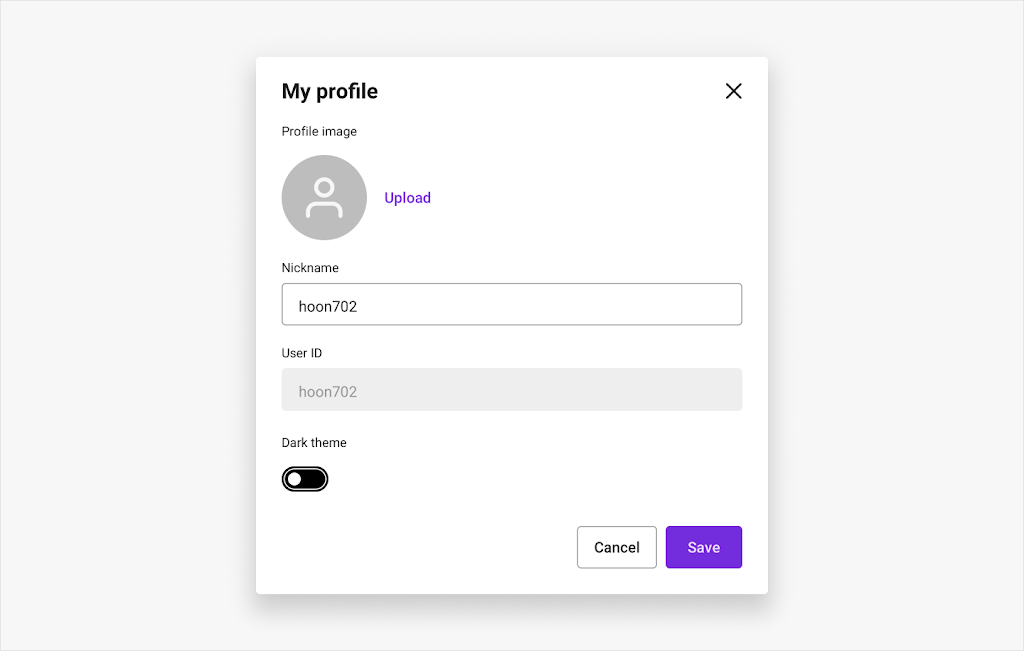
EditUserProfile
The EditUserProfile module allows the current user to make changes to their profile. By clicking on their own avatar, a pop-up window with their profile information appears. Here, users have the option to edit their profile image, nickname, and can toggle the theme to be in light or dark mode.
EditUserProfile has 4 optional properties that include children, onCancel, onThemeChange, and onEditProfile. The children property is used to see the child components on EditUserProfile that EditUserProfileProvider provides us. onCancel is used to run an operation when the UI is triggered from the user clicking to cancel any edits they have made. If you would like to add additional styling based on whether the chat is in light or dark mode, you can use onThemeChange to call a function that implements custom CSS when a user clicks to change the theme. Lastly, onEditProfile allows you to implement a set of actions once the user has updated their profile.
UIKit provides EditUserProfileProvider and useEditUserProfileProviderContext hook as context objects for the EditUserProfile module. Both of these can use the same optional properties as the EditUserProfile: children, onCancel, onThemeChange and onEditProfile.
The only UI component in the EditUserProfile module is EditUserProfileUI, which renders the view of the user profile.
The default design for EditUserProfile will look like this:
Next steps with Sendbird's React UIKit
We have reviewed in detail the core components and modules that Sendbird's React UIKit provides. With this strong foundation set, we will now be able to decide which components and modules are necessary to support different use cases. As an example, check out our tutorial about how to build a WhatsApp messenger clone with Sendbird's React UIKit. In this tutorial, you’ll understand how to build your own custom WhatsApp-like chat experience using the core components and modules we discussed throughout this tutorial.
For more information, please check out our docs or explore the wealth of UIKit tutorials on our developer portal. If you need help with the Sendbird UIKit, check out the community forums or contact us. Our experts are always ready to help!
Happy chat building! ✨