7 fintech UX trends you need to know in 2023

A streamlined, intuitive fintech UX (User Experience) does the seemingly impossible: makes finance fun!
But how does a financial services technology company make the jump from intuitive fintech UX design to making finance fun? The key lies in understanding the sky-high expectations of today’s consumers.
With the world at their fingertips, today’s tech-savvy, well-informed, independent (and often impatient!) customers are empowered with information. At the same time, multiple brands vie for their attention, offering personalized services and support in an effort to increase CSAT as part of their CX strategy. With consumers inundated with options, the pressure is on brands to impress them.
The secret to gaining - and keeping - customers’ attention is to design products that put customer needs first and give them what they want. Brownie points to fintechs that can give customers what they didn’t even know they needed!
How does this happen? If fintechs study their consumers and pinpoint innovative, creative ways to make the customer experience even better than expected, half the battle is won right there. After all, as Steve Jobs said, “A lot of times, people don’t know what they want until you show it to them.”
One critical aspect - if not the most critical aspect - of this approach involves removing friction and embedding user experience design into every decision, which is the foundation of all the features you can add to make finance fun.
Before diving into the details, however, let’s take a look at how today’s fintech companies are setting a new bar for financial services.
What sets fintechs apart from traditional financial services providers?
Traditional financial service providers struggled with dry user interfaces that were confusing and intimidating to use. Part of this included complicated menus, hidden features, financial jargon, and unhelpful customer service.
Today’s fintechs, however, offer several key benefits over banking and other financial services incumbents, such as a lower barrier to entry, better service, and greater ease of use.
Here are the top 3 ways that today’s fintech companies are a world apart from their traditional counterparts.
They have a lower barrier to entry
With services like fully mobile accounts and low- or no-cost stock brokering tools, fintechs lower financial services’ barriers to entry. This levels the playing field and makes it easier for underserved consumers to take control of their money and, ultimately, achieve financial freedom.
Related to this, many fintechs make educating their users a top priority in response to the massive appetite for financial knowledge. This includes investing in courses, webinars, podcasts, events, and product-driven social communities where users can learn from one another.
They provide better service
Fintechs thrive on finding new ways to leverage customer data to provide better, more personalized solutions to users’ problems.
Compared to traditional financial services providers, fintechs also tend to invest more in self-service help or support options like detailed FAQ content, well-trained chatbots, user communities and forums, knowledgeable social media response teams, and mobile-friendly support channels like in-app chat.
This way, fintechs can meet their online-native customers where they (the customers) are comfortable—instead of forcing them to visit a branch or (shudder!) make a phone call to resolve their issue.
They’re easier to use
Fintechs design their products with the customer’s user experience in mind. From the account signup and verification process to checking balances and spending trends, making immediate payments to friends, setting financial goals, tracking savings progress, to contacting support—successful fintechs actively remove friction from the equation.
Historically, financial services websites and apps haven’t been exciting or engaging tools to use. Even now, most banks, insurers, and investment firms tend to have boring, corporate, cold user interfaces that scream SAFE and PREDICTABLE while being surprisingly confusing and intimidating to actually use. This is due partly to complicated menus, hidden core features, indecipherable financial jargon, and impossible-to-reach customer service.
In light of this, it’s hardly surprising that fintechs have turned this industry upside down by simply putting the customer at the center of their business model and designing a better user experience.
This boils down to a few core UX principles:
Help the user achieve more items on their mental to-do list in one place
Allow the user to do what they’re trying to do with as few taps or clicks as possible
Keep your menus simple, intuitive, and easy to navigate
Use simple, accessible language that users understand
Keep your most important features front and center
Make your user interface (UI) design uncluttered, calming, and visually pleasing
Provide easily customizable data visualization tools
Help your users reach their goals by incentivizing desirable behaviors
Use gamification elements to make boring tasks more fun
Below, we dive into the top seven UX trends for fintechs. While some of them build on these basic and fairly universal UX principles, others are more specific to the fintech user experience and the major trends currently playing out in this industry.

The only UIKit you need to build in-app chat.
Top 7 fintech UX trends to follow in 2023
UX trends come and go, but typically they follow the same core principle: make it as easy as possible for your user to achieve the job they came to your app to finish.
Of course, part of what differentiates fintechs from more traditional financial services and banking incumbents is that they seek to innovate the financial services landscape.
This means most of them aren’t just trying to do a single “job” for the user. Instead, the good ones go beyond simply processing transactions and actively seek out additional jobs to be done or problems that they can solve.
In doing so, they create an unforgettable user experience that makes users’ lives easier and keeps customers coming back time after time.
Below, we explore seven fintech UX trends you should know about in 2023.
1. Clean branding & user interface design
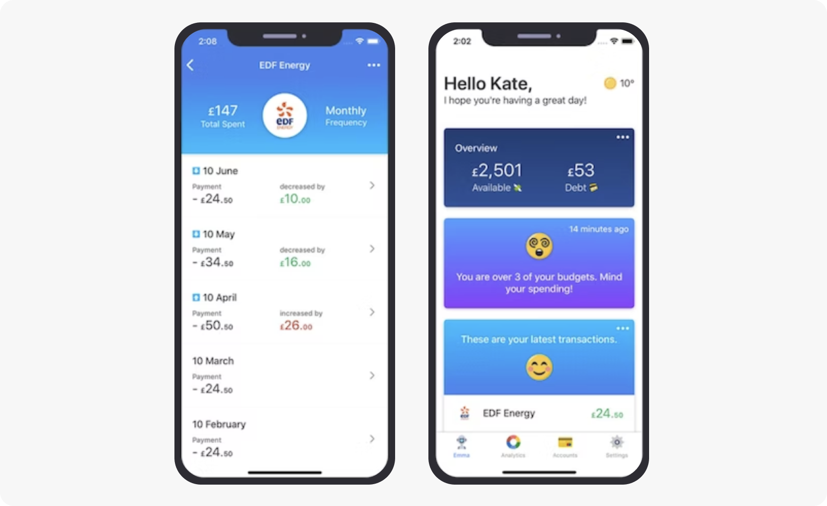
Whereas old-school financial services branding tends to be fairly bland and monotonous, fintech brand identity and user interface design have changed to make financial services seem more personable.
Here are some of the characteristics of a clean fintech brand identity and streamlined UI design:
Welcoming fonts & colors: Convey personality and reduce stress
Short, clear, uncomplicated copy: Ensures less financial jargon, easy to understand
Info buttons: Get help or additional information easily
Predictable screen maps and menus: Positions core features in an easy to find manner
Emojis, memes, and gifs: Make finances less intimidating
Plenty of “white space”: Reduces mental load and unwanted friction
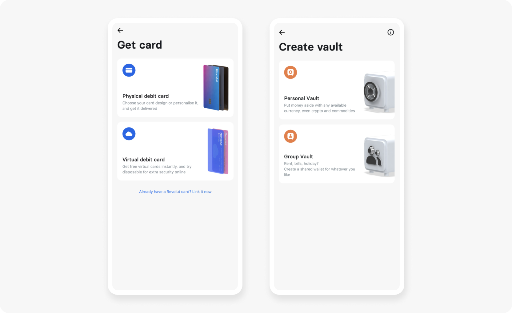
2. Mobile-first banking
Mobile-first banking means building your financial services product on a mobile foundation, enabling customers to access all your services from the comfort of their smartphones. In fact, these days, many fintechs and neobanks don’t have physical branches at all.
That’s why fintechs need to offer a consistent user experience that’s not only highly functional but also intuitive, easy to use, and comprehensive—allowing the user to do as much as possible in one place.
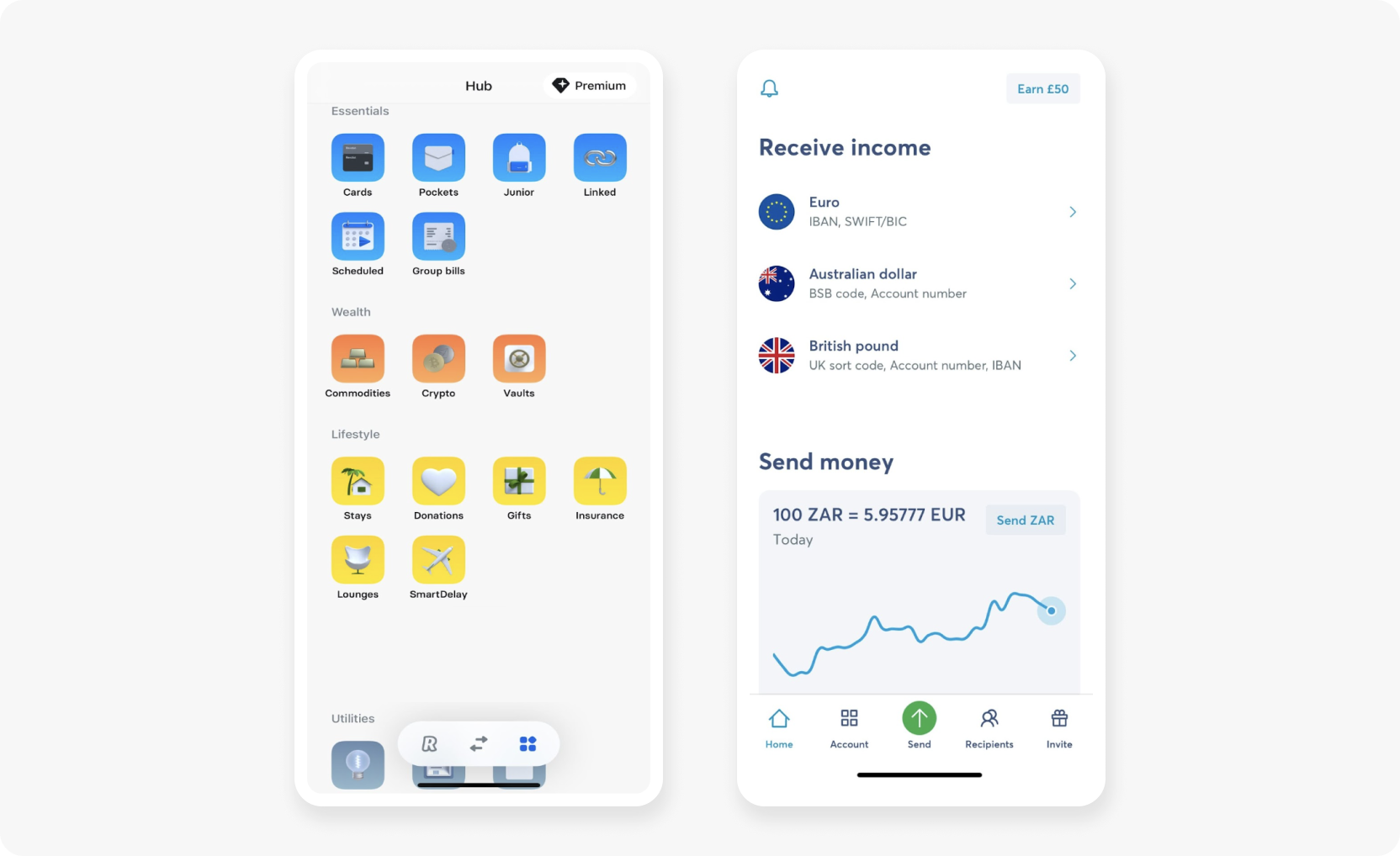
It’s becoming common practice for fintechs to offer seamless integrations with a wide range of third-party services, effectively turning their apps into ecosystems that go beyond financial services.
Integrations with crypto exchanges crypto trackers, stock brokerages, utility bill portals, travel booking platforms, and more let users manage everything from their budgets to lifestyle and social interactions in one place.
Source: Revolut
3. Gamification & behavioral banking
Incorporating gamification into your user experience can make the task of personal finance management less stressful for users.
Essentially, gamification refers to the use of gameplay elements—like point scoring, rules, rewards, and competition with others—to make the user experience more fun and engaging.
Some popular gamification tactics include positive behavior streaks, points earned, progress bars or rings, challenges, badges and stickers, leaderboards and social challenges, redeemable in-app currency, and, of course, rewards.
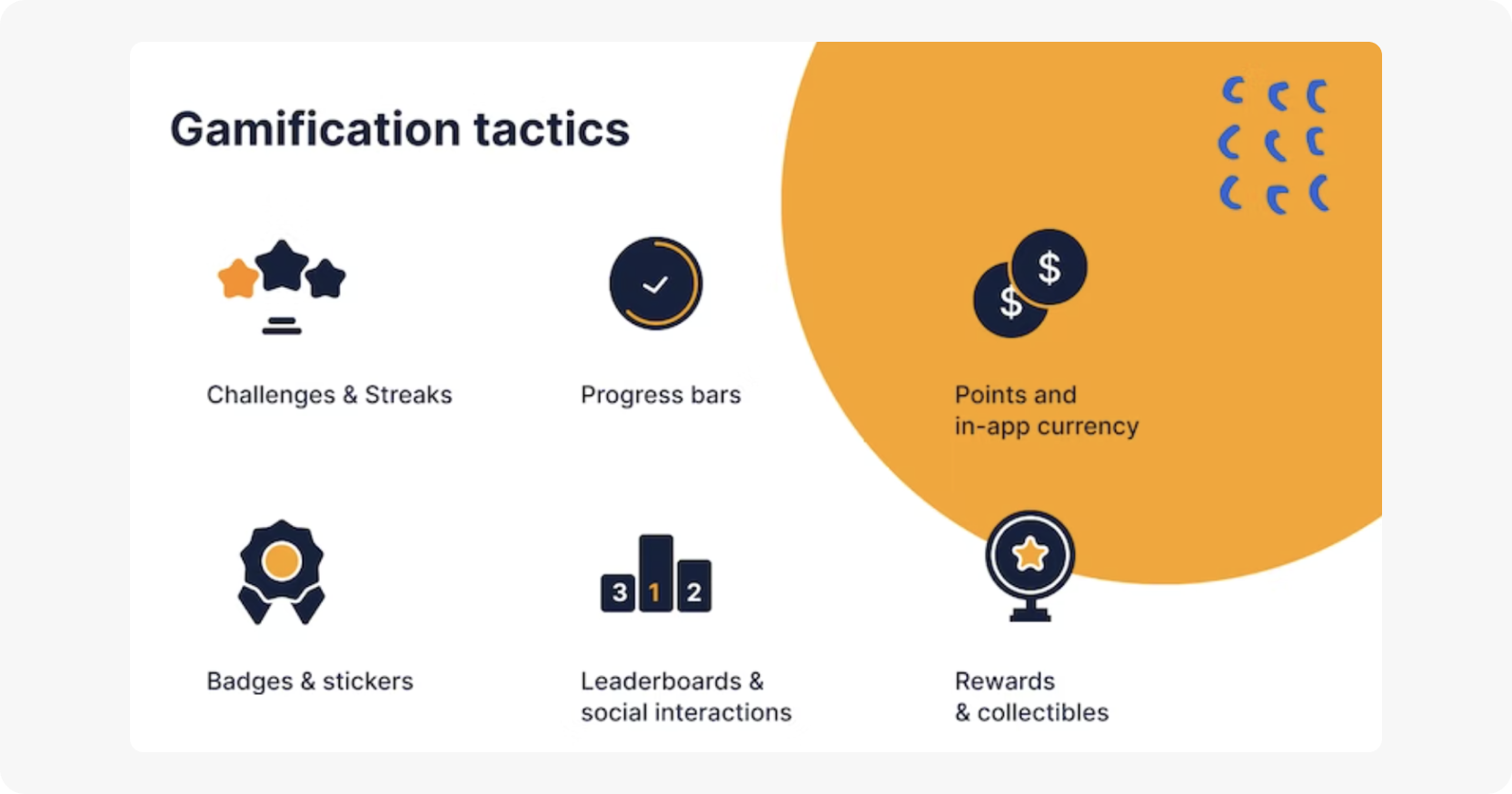
Using gamification tactics can be a powerful way to frame positive actions (such as setting a weekly budget, categorizing transactions, and staying within your budget) as a series of achievements or accomplishments.
Source: Discovery Bank
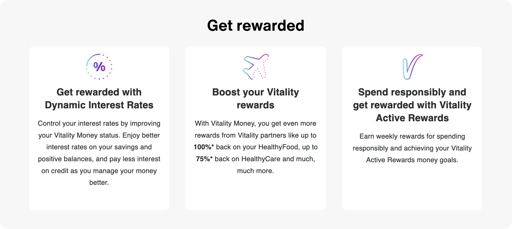
Fintechs can use gamification to not only drive app engagement but also to incentivize actions that contribute to financial health, as seen in what South Africa’s Discovery Bank calls “behavioral banking”.
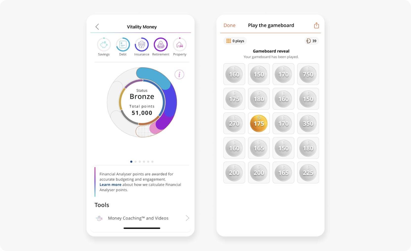
Source: Discovery Bank
4. Data visualization
Instead of just showing users their account balances in boring numbers, give users the option to view their financial data in visual formats like pie charts that show their spend breakdown by category, and graphs that compare monthly income or expenditure.
Good data visualization helps users to better understand the relationship between their earnings and expenditure. This is especially true for visual learners who process information more readily when it’s presented in an easily digestible visual format.
Giving users the ability to customize their dashboards and do things like filter by category or date range and export their data, offers more control while making your app more useful.
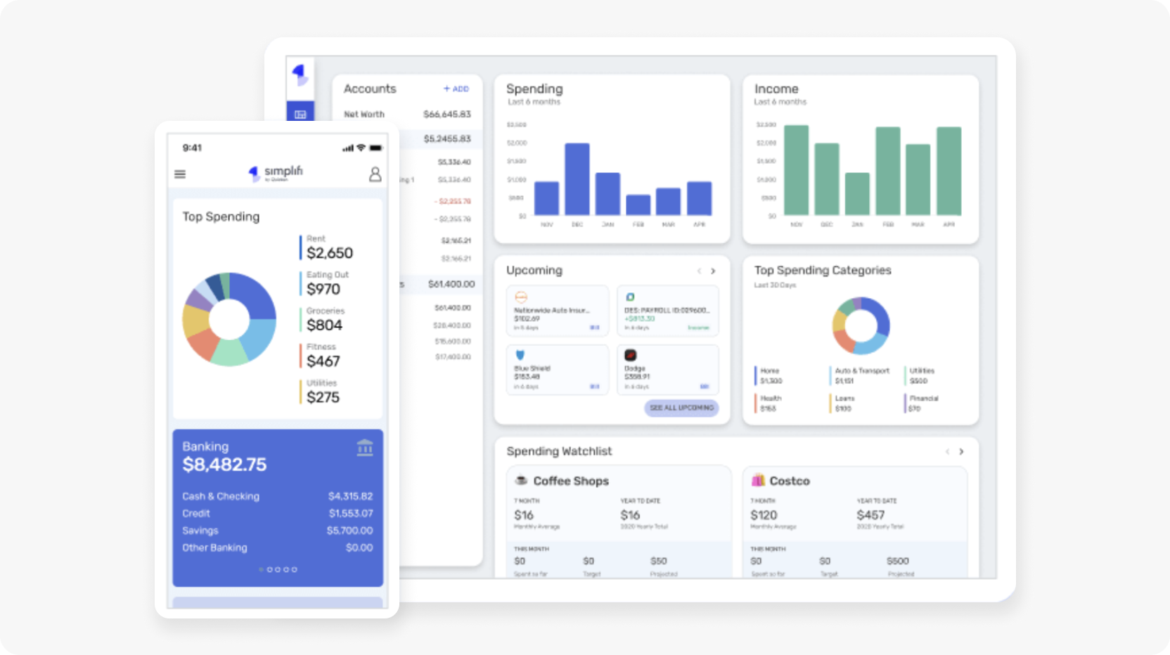
Source: Simplifi
5. User onboarding and authentication
Effective user onboarding is a crucial part of remaining competitive in a landscape where convenience is king.
Ideally, you want to make the registration and authentication process as easy and frictionless as possible for the user, without neglecting security and regulatory compliance (looking at you, KYC requirements!).
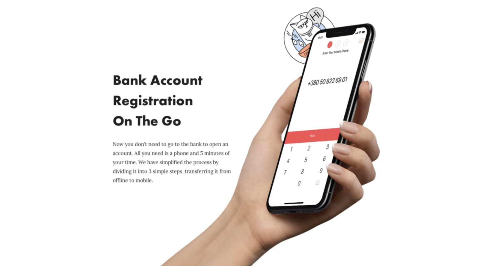
Source: Monobank
It’s become a common practice among fintechs like Revolut to make the account signup process seamless and ask for additional verification documents like proof of address at a later stage.
For instance, you might ask users to snap a photo of an ID document and take a selfie in the initial account registration process, onboard them and get them comfortable using your app, and then send a follow-up prompt to obtain additional documents.
For compliance purposes, you might restrict certain account actions until you have the necessary documents on file, but the key is to get users registered and onboardedas quickly as possible so they can see the value your app offers before getting hit with the admin tasks.
Don’t skimp on your onboarding experience. Use a quick introductory walkthrough such as an animated tutorial to show new users how intuitive your app is to use and highlight key features.
Highly visible visual prompts and pop-up messages showcasing new features, and how to use them (and where to find them!) are also good ways to help new users make the most of your fintech app.
6. Conversational support
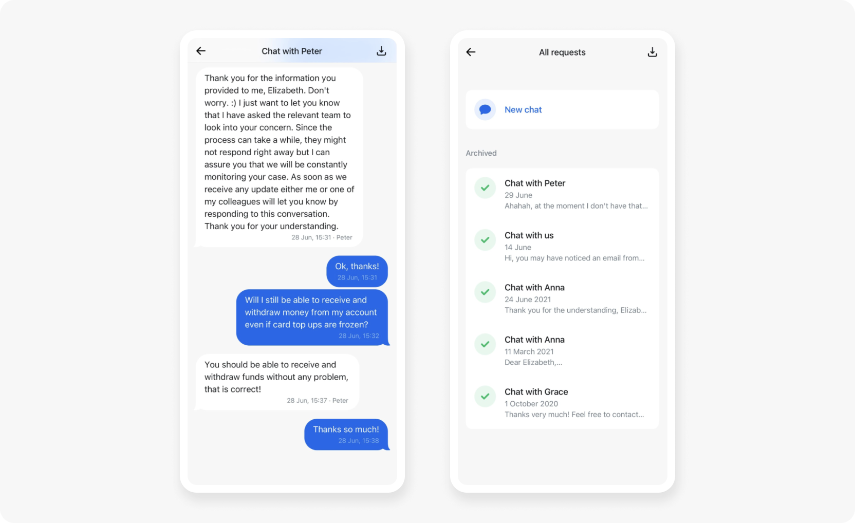
One of the most important support features you can include in your fintech app is chat or messaging functionality. At its most basic, this allows users to message company reps or agents for real-time personalized service. Done right, conversational support goes beyond addressing product issues and provides concierge-level service.
Service agents should have immediate access to the user’s file, including their account information and record of past interactions. This should go over and above what a chatbot would do.
This means they should prioritize human communication and answering the customer’s questions and resolving their issues.
Source: Revolut
7. Social banking
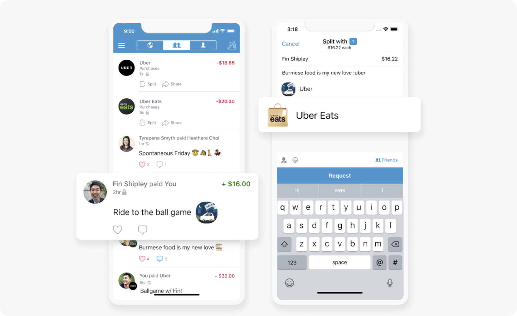
A growing number of fintechs are now social by nature. For instance, the popular peer-to-peer payments app Venmo allows users to send one another direct payments accompanied by a note (or emoji).
Venmo users can also browse social-media-like activity feeds that show recent transactions and their respective notes, often making for an entertaining (and sometimes deliberately mysterious!) reading experience.
Source: GetApp
With its robust dashboards and built-in chat feature, the personal finance app Honeydue helps couples manage their finances together by tracking and discussing transactions, goals habits, and goals—in context.
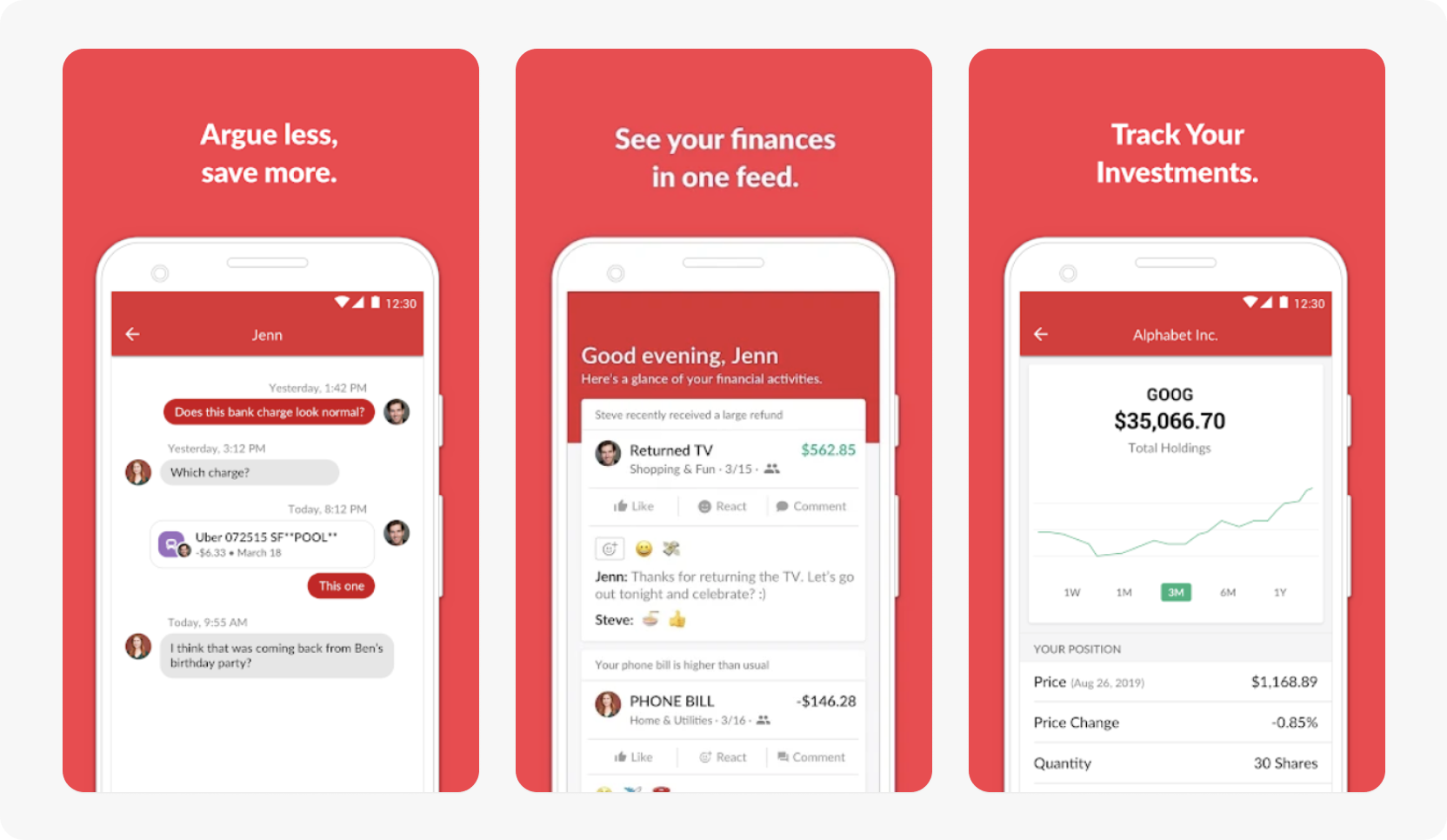
With the rising demand for financial literacy, some fintech apps offer access to in-app resources, communities, forums, and chatrooms where they can learn about—and engage in meaningful dialog about—personal finance and investing.
While most typically used to connect users with customer support agents, in-app chat can be a powerful community-building feature. In-app chat allows users to message one another directly, whether it’s to say thanks for sending payment for that split bill or to ask their spouse about a suspicious transaction on a shared account.
Use Sendbird to improve your fintech app's UX - and make finance fun
While all of the fintech UX trends mentioned above are important, some of them are already par for the course, while others are emerging and present opportunities to differentiate your fintech offering from the crowd. Chief among the latter category are the trends of gamification, conversational support, and social banking.
Adding a social layer to your product is rapidly becoming a tactic to differentiate yourself from the competition. People are social creatures by nature, and products that have social interaction embedded into their fabric benefit from network effects, increased staying power, and a range of other advantages.
Sendbird’s in-app chat API and SDKs give you the tools to make your fintech app social-first for an improved user experience and a significant engagement boost.
Read about how mobile payments app PicPay used Sendbird to offer users a social engagement layer and found that the resulting network effects lead to an increase in transactions and average spend.
Sign up for Sendbird (free for 30 days (or forever!), no credit card required) and improve your fintech user experience by implementing a secure in-app chat solution.


