Introducing our new product logo lineup: A unique brand identity for Sendbird Chat, Calls, Live, and more

Sendbird’s brand design team manages and develops all brand elements for a consistently top-quality user experience. These brand elements range from colors to icons, splash screens, ads, and more – indeed, they include almost anything that an end user sees. These form an integral part of Sendbird’s brand identity. The challenge, however, is to establish the identity of each product as unique from the rest. How did the brand design team do this?
To solve this problem, the brand design team at Sendbird spent a lot of time coming up with the visual identity of each product we offer as we continued to develop our overarching brand design system. We’re excited to present a quick recap of our journey of creating a unique brand identity of each product, and the solutions we were able to find. Let’s dive in!
Why does each product need a unique brand identity?
To improve product presence and engage users, it’s important to establish a unique brand identity for each product. This is critical because not only does this strengthen recognition for a product, but also helps with further increasing the product’s value.
At Sendbird, we were aware of the need but had to wait for the optimal time to start exploring this new realm as we had been focused on other priorities. With Sendbird’s rapid growth, we started offering more specialized products, which meant that we started feeling the itch to differentiate each product in detail.
The sentiment naturally began to be shared among teams and other departments. Therefore, we thought this was the perfect time to develop the brand identity of each product and strengthen not only their branding but also their value. Here is how we did it.
1. Recognizing the issue & understanding product characteristics
First, we had to research how our teams were introducing Sendbird’s products and how the products were being differentiated – both by our team and in the minds of users. We met with each team to hear more about what kind of difficulties they faced with the existing product logos.
Sendbird is unique in that all of our products rely on the chat API and SDK, so it’s hard to see each product as a separate entity. When adopting Sendbird’s chat features, customers can add on extended products like chat, calls, and live, which means we needed to keep in mind two important facts when branding each product:
- We needed cohesive branding to show all products stem from Sendbird
- Users needed intuitive design that clearly shows each product’s characteristics
The only UIKit you need to build in-app chat.
2. Sketch and design
After figuring out the issues that we faced with the previous branding of Sendbird’s products, we started developing the identity of each product on the basis of Sendbird’s icon design principles. This was a crucial step as icons play an important role in digital products. Icons have to be simple, intuitive, and they need to express the features of a product.
Because each product represented Sendbird, the branding had to be clear in that approach. We used intuitive metaphors so that each product was easy to perceive while utilizing the symbolic shape, characteristics, and graphic elements of the existing Sendbird symbol. This maintained a cohesive look with the main brand.
These are the main principles we kept in mind:
- Icon design: Simple, intuitive, functional
- Sendbird brand matrix S1: Use core brand elements across product logos
- Encompass Sendbird: Utilize features of the main symbol
We first worked on coming up with several drafts utilizing metaphors associated with each product. Some metaphors were intuitive while their graphics were complex; other metaphors were rather generic, with little identity, but with simpler graphics.
We walked this narrow bridge and then narrowed it down to a few drafts that closely connected with our design principles and expressed Sendbird’s identity well. We also tested various elements such as line thickness, spacing, and corner values so that these logos could be used for various situations.
3. Review and finalize
We finalized the brand logo for each product and met with the product managers to review the logos one last time. Just as we had anticipated, there was feedback on how to keep a cohesive unique brand identity among all products so that each was not perceived as a separate entity, but rather a part of Sendbird. We ran several meetings again, revising the icons once more, and made sure we didn’t leave anything out. This is how we finalized the brand identity of each product.
Systematizing the unique brand identity of the new product logos
Systematizing the new unique brand identity of each product is as important as creating the new logos. This is so that they can be used in the right places to help better with brand recognition. To make this possible, we gathered all our logos and made a usage guideline to maintain our overall brand identity while differentiating each product properly when needed. We came up with the following three types to be used for different purposes:
A. Product logo (Primary)
These are simple symbol icons. Unlike open source icons, the icons reflect the characteristics of each product and are used when the products need to be portrayed visually. To make sure they are perceived as Sendbird products, each product icon is then followed by the text version of the product name (e.g. Sendbird Chat, Sendbird Calls, etc.)
B. Product logo (Horizontal)
This is the horizontal version of the product logos. They are used in situations when the main company logo needs to be present, and the products still need to be differentiated.
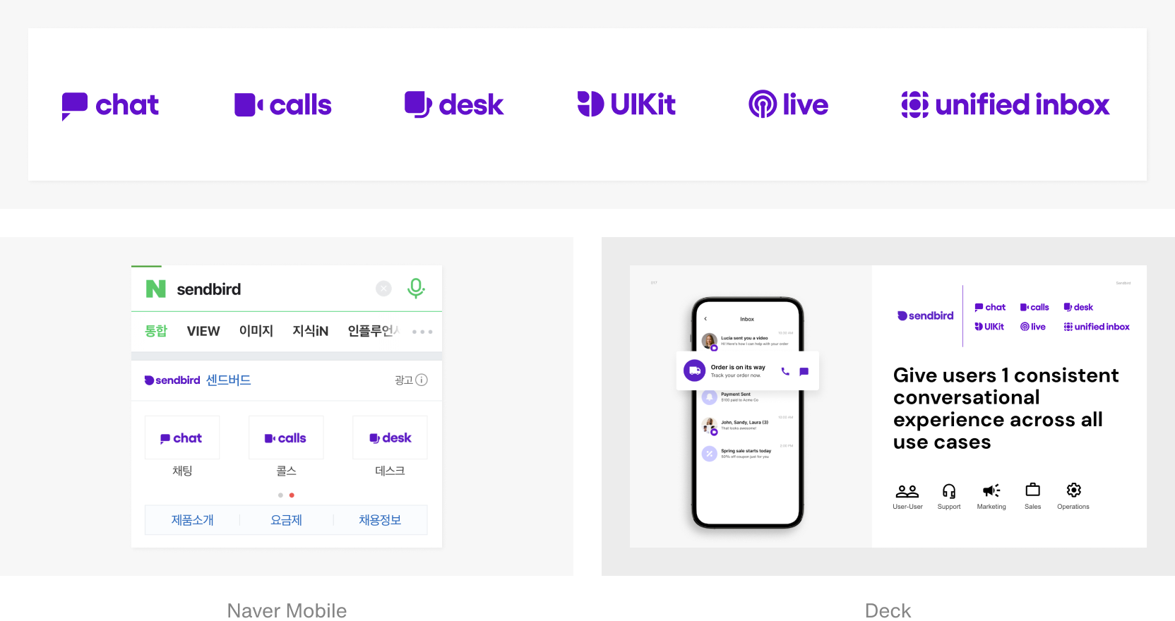
C. Product logo (Lockup)
The lockup version was developed for situations when customers discover Sendbird and its products for the first time. This is the Sendbird logo with each product name in text.
Looking to the future of Sendbird’s new product logos and brand identity
It has been four months since we developed the unique brand identity of each product. Now, all of Sendbird’s departments are actively using the new logos. The brand design team continues to manage the logos so that they are used correctly in different situations.
It was difficult coming up with new logos for each product from scratch. Through the challenging process, we learned lessons that have accumulated to help strengthen Sendbird’s brand assets and overall brand perception. We would like to thank our team for their passion through countless meetings to come up with a good direction for our brand logos. We hope this blog helps in your design journey!