
8 examples of good app design in action


When do you use your smartphone? Or, rather, when do you not use it?
The average American looks at their phone 144 times daily, and almost 90% of our on-phone time is spent using mobile apps. With this in mind, how could you not focus on the design of your app and how users interact with it?
Your app's user experience and design elements are often consumers' first impressions of your brand. Building your design rule book and UI guidelines is extremely important in a cohesive, branded experience.
Here are some examples of well-designed apps to take inspiration from, plus some guidelines on app design best practices.
Mobile app design best practices
Two design methodologies must come together to create an app that users love.
The user interface, or UI, design considers the displays, buttons, iconography, and other visual components that people interact with within an application.
User experience, or UX, the design focuses more on creating a pleasant overall in-app interaction for users.
To help you tackle both in your quest for good app design, we’ve compiled this concise list of the best app UI and UX standards and best practices.
The only UIKit you need to build in-app chat.
UI tactics
Exercise progressive disclosure
Progressive disclosure is a technique in app design in which you spread steps and information across several consecutive screens. This is often seen in the onboarding phase when first signing up for an app when it’s critical to complete several necessary steps to finish the process.
With progressive disclosure, application designers can provide users with a lot of information while still avoiding overwhelm — and even entice users to dive deeper and become more engaged within the app.
Design with humans in mind
Ever been frustrated by a seemingly-clickable element on a mobile app that you can’t quite click on? Don’t be that app, or you’ll risk scaring off users and quite possibly diminishing conversion rates.
Whatever platform your software is for, follow its guidelines for sizing clickable elements on mobile devices. For example, Apple recommends tappable areas be a minimum of 44x44 points for iOS devices, and Google says at least 48×48dp for touch targets for Android.
In addition to size, consider how buttons are styled, colored, and labeled to maximize visibility and usability for all audiences — stay tuned for a deeper discussion on accessible design for disabled people.
Carefully plan placement
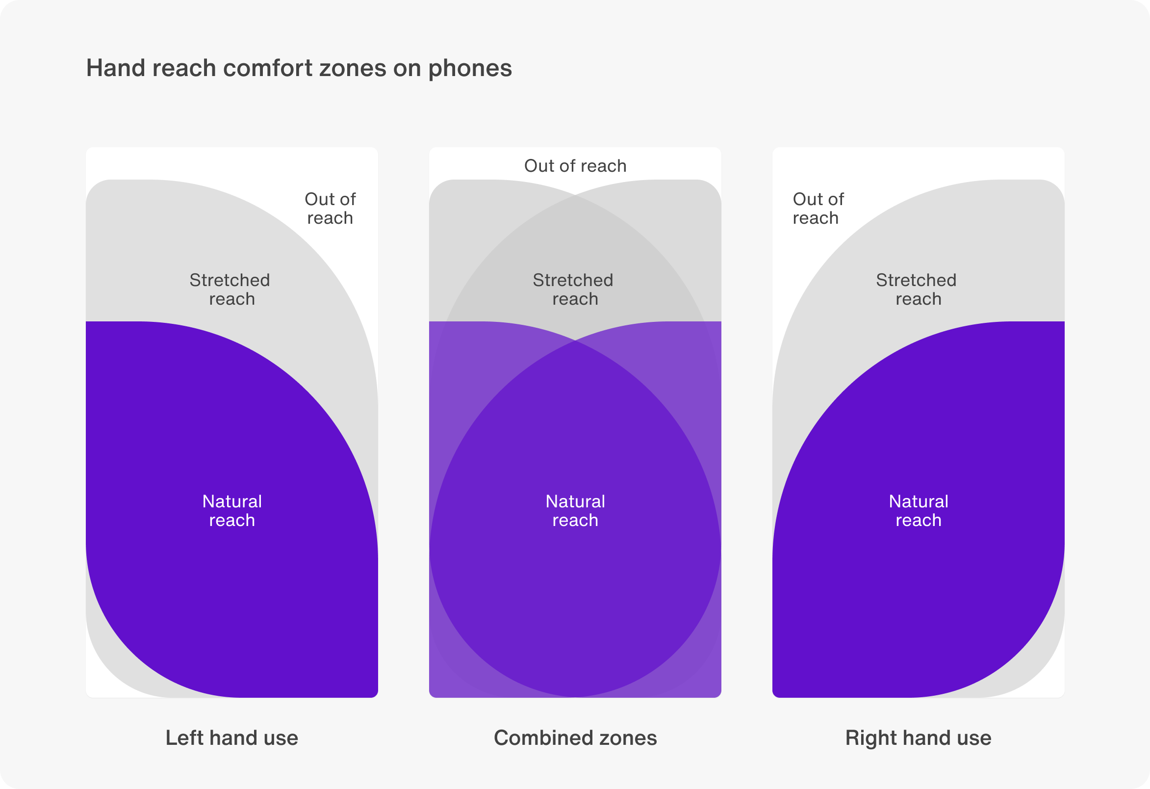
You can only fit so much on a smartphone screen, so how do you decide where to put what?
When you think of the areas within reach while users scroll, you can place the content and elements you want users to see and interact with the most in those zones.
UX tips
Inject community for engagement and retention
Today, creating a strategy around building community is just as important as creating a marketing plan.
Community is core to generating in-app engagement, user delight, referrals, and of course, retention. One of the best ways to create a community within a mobile application is via a third-party chat plugin that features individual and group chat alongside voice and video calls, multimedia, moderation, notifications, privacy, security, and beyond.
Keep it accessible
More than a billion people around the world live with disabilities today. Unfortunately, they’re often locked out of using mobile apps that don’t account for their needs.
Set your app apart by following the guidelines to mobile accessibility by the leading international internet standards organization, World Wide Web Consortium (W3C). These cover everything from zoom to contrast, keyboard controls, design element size and spacing, layout, positioning relative to scroll, and a lot more.
Maximize load speed
The longer it takes a screen to load, the more likely app visitors will click away — and possibly never return.
Avoid losing valuable audience members by maximizing how fast your app loads. Many things can be done in the design and build process to create speed:
Optimize graphics to reduce their weight
Streamline the layout
Minimize your redirects
Apply lazy loading to delay resources or objects from loading until they’re necessary
Avoid heavy, unnecessary features or plugins (also good for increasing security)
Use the best code language for the application
Display loading graphics that help distract users from a longer wait
Get even more tips from our guide: Top 15 must-know mobile app UX best practices.
Eight amazing app designs to take inspiration from
With the above best practices in mind, let’s shift into some examples of well-designed mobile applications that exemplify cutting-edge UI and UX design, functionality, and more.
Blocket: Robust third-party messaging experience
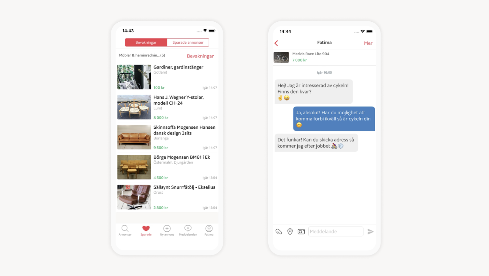
Sweden’s leading marketplace Blocket from the Schibsted family of brands realized when it lost its built-in-house chat solution that it didn’t want to focus its resources on creating it again from scratch — and that its needs had changed in the meantime.
With chat messaging from Sendbird, Blocket users enjoy modern features like one-to-one and group messaging, notifications, read receipts, rich media sharing, and more.
Conversely, Blocket benefits from uptime for the hundreds of thousands of conversations it hosts daily, flawless scaling, GDPR compliance, and additional privacy and security measures.
We wanted to spotlight Blocket for epitomizing how mobile apps can use integrable third parties to increase their functionality while focusing on main money-making capabilities.
Houzz Pro: Bringing AR to the masses
Houzz Pro is software for home designers and contractors to manage projects, leads, and business admin tasks in one place.
What caught our eye is their built-in augmented reality (AR) function, which pros can pull up via mobile app to show clients and vendors their vision for a room.
It’s progressive features like this that expose the masses to fantastic technological advancements when coupled with the mobile devices we’re all familiar with.
Darkroom: Simplifying the complex
Darkroom is a well-known and capable photo and video editing app with a surprisingly user-friendly interface when you consider its power.
We chose to feature Darkroom because it simplifies complex processes through thoughtful UX and UI design. Darkroom leads pros and amateurs creators alike through the steps of creating beautiful media. Alongside its beautifully-simple design — artificial intelligence (AI), shortcuts, filters for saving your most-used edits, and tons more free (and paid) features are what led Darkroom to be featured in the Apple Design Awards 2020.
(Not Boring) Habits: Gamifying daily life
We wanted to highlight the (Not Boring) Habits mobile app because it brings gamification to everyday life.
Gamification applies gameplay elements (scoring points, competition, etc.) to areas outside of gaming, such as within a customer support team, to encourage friendly competition and rack up performance.
(Not Boring) Habits use gamification to encourage users to build good, new practices and break poor, old ones while completing eight levels over 60 days — the amount of time it takes for a habit to become automatic.
It doesn’t hurt that the app does everything with exciting and dynamic animated design.
Slack: Showing how onboarding is done

Slack has done a lot of work simplifying its mobile app onboarding process, which is essential when you consider how many people from all walks of life and every level of technical experience sign up for it daily.
Slack applies progressive disclosure, giving new users just enough information to make it to the next onboarding phase. While people can technically close out of the workflow as soon as they’ve created a profile, Slack uses design and content to keep the process flowing so new folks can learn even more and become entrenched in the application.
Hostelworld: Bringing community to the digital space
When the creators of the Hostelworld travel mobile app discovered that more than half of their users were solo travelers, they decided to create a way to connect them to form relationships before they even met — and maintain support systems long after they went their separate ways.
When Hostelworld revamped its app to feature chat messaging, it chose Sendbird to access all the rich media messaging and chat room functionality it wanted but didn’t have the in-house expertise to create.
Hostelworld is a prime example of how a community can easily be slotted into mobile apps to increase the stickiness that leads to more time in-app — and the conversions accompanying it.
Passenger Assistance: Good app design is accessible
Passenger Assistance, a 2023 finalist for the Apple Design Awards, empowers disabled people and those who care for them by making it easy to book assisted travel via train in Great Britain.
The Passenger Assistance application collects information on the person’s impairment and the required accommodations. It then connects multiple train operating companies to make it easy to plan an end-to-end trip before ever leaving home. They are looking to further the features to expand into additional methods of travel.
Developed in cooperation with accessibility experts, Passenger Assistance is a winning example of a mobile app that considers accessibility on all levels.
Meetly: Where style, accessibility, and design meet

At first, we thought Meetly’s mobile app looked pretty striking with its dark theme.
And it does, but what we think is even more interesting is how thoughtfully they’ve approached their dark-first design.
Across the app, Meetly has made typography, illustration, and design choices that align perfectly with their dark background. They’re also evident and legible, which is important for accessibility.
This styling combines to create a solid and recognizable brand that sets Meetly apart in the sea of meeting apps that have sprung up in the newly-remote world.
Focus on your best app design, let Sendbird handle the rest
Sendbird makes it simple to create an industry-leading conversational experience within your mobile app — no time-consuming or expensive app development or maintenance required.
Tap into our easy-to-implement chat, voice/video calling, live streaming, customer support, and ChatGPT-powered AI bot features to increase your mobile app’s capabilities all while you focus on creating a design that consumers love and leaves competitors scrambling.
It’s free to sign up and start using Sendbird. Or, you can contact sales to learn more about what Sendbird has in store.